
Simplify Wealth, Amplify Growth – An app by Finserva
Redesigning a beginner friendly trading & Brokerage Experience


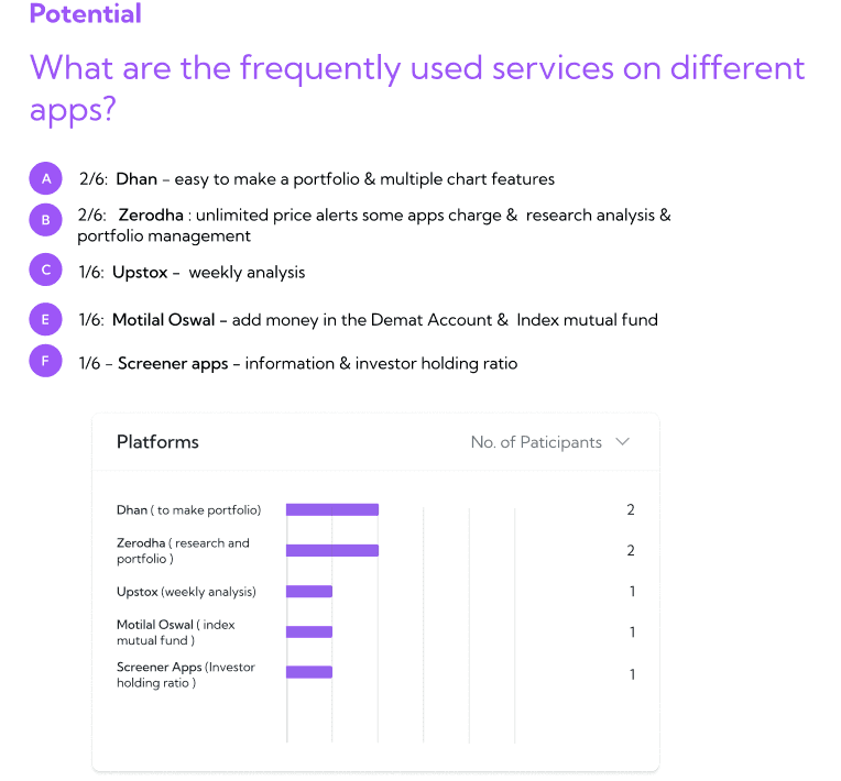
MF Calculator
Monthly SIP
One - Time
SIP Amount
₹5,000
Expected return rate(p.a)
10.5%
Select Duration
2 Yr

Invested Amount
Return Amount
SIP
Investment of ₹1,80,000
₹2,45,734.34
(+10.05%)
Fixed Deposit
Investment of ₹1,80,000
₹2,00,125.00
(+6.5%)
Explore Mutual Funds
9:41
Overview
The Finvasia Group sought to revolutionise the fintech industry in India by enhancing their app’s UX and UI, creating a more intuitive and user-friendly app and website experience.
My Role
UX Research
UX Design
UI Design
Type
Responsive Website
Duration
2 months
Business Type
B2B
Problem Definition
Many trading platforms in India have high brokerage fees or complex interfaces, making trading difficult for both beginners and experienced traders.
Objectives
To create an app and website whose interface is simple and user-friendly.
To educate users who are beginners in trading with comprehensive UX writing.
To provide commission-free trading and advanced features to make investing more accessible for everyone.
Brand & Strategy Kickoff: Understanding the problems & Brand Vision
Things tried & not worked before by the client

UX Research
UX Audit was conducted to
Identify usability issues affecting user satisfaction.
Improve engagement and conversion rates.
Ensure accessibility and inclusivity.
Enhance efficiency.
Align with user needs and business goals.
User Interviews
Conducted & Analysis 11 interviews with 6 potential users and 5 existing users.
Competitors Analysis & Feature Mapping
Features
GTT Feature
Data Visualisation
One Click Trading
Comparing funds
Different payment modes
Loan on the basis of portfolio
0 Brokerage fee
Our App
✅
—
✅
—
—
✅
✅
Kite(Zerodha)
✅
✅
✅
—
✅
✅
—
Analysis of Target Group
User Personas

Use Case Scenarios
How will the user interact with our platform

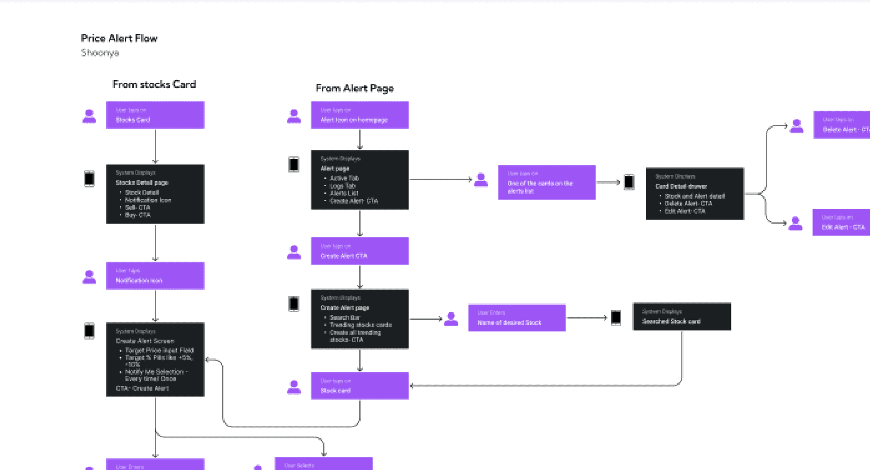
Information Architecture
Task Flows
Sitemap
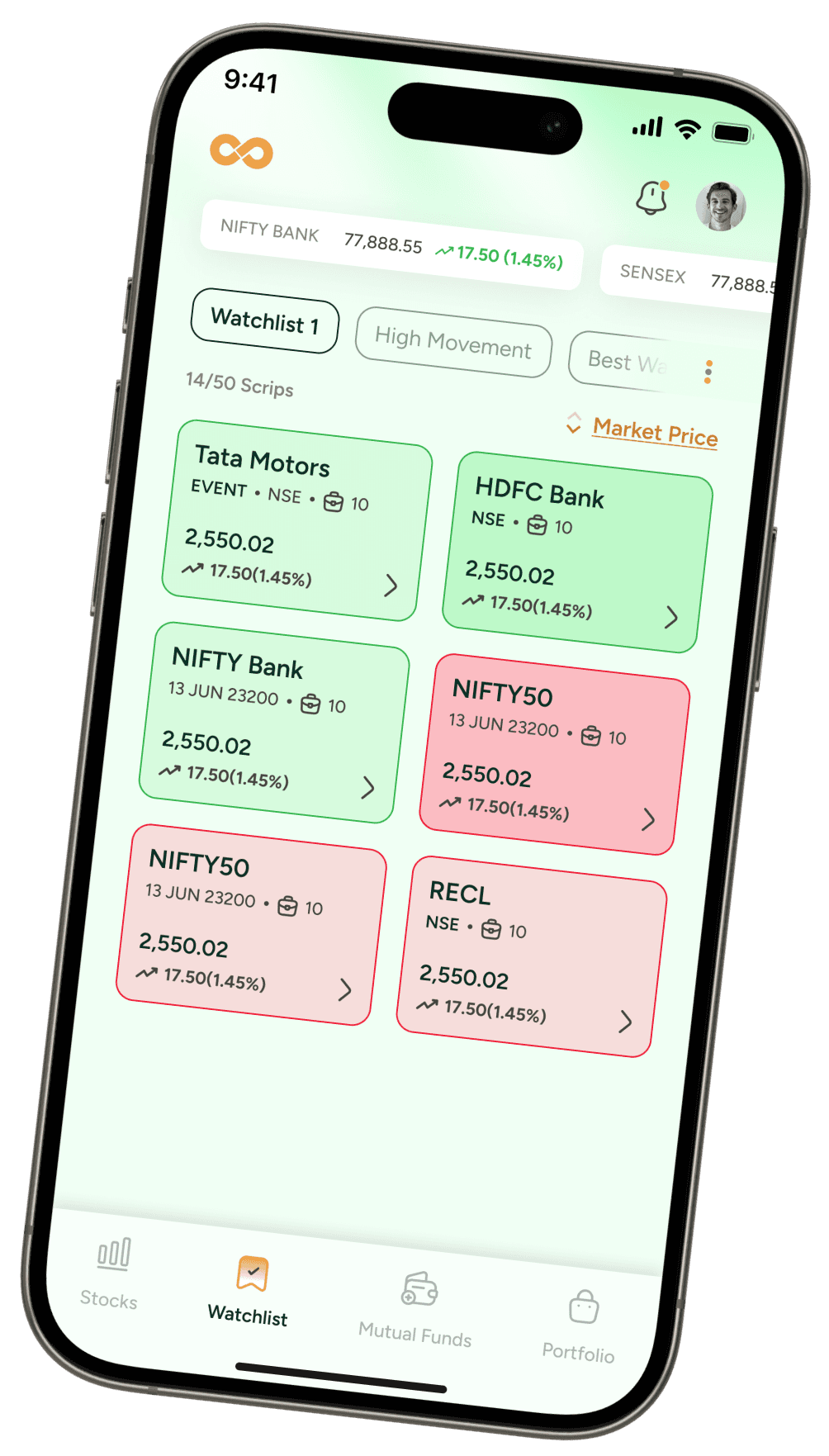
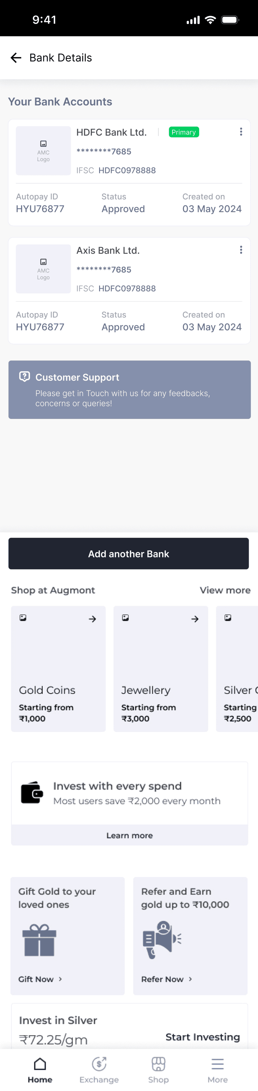
Stocks (Home Page)
All Indices (horizontal scrolling)- clickable
Indices card
Name
Value (green or red)
Negative or positive amount
Search Bar
Upcoming IPO’s
IPO Cards
View All CTA
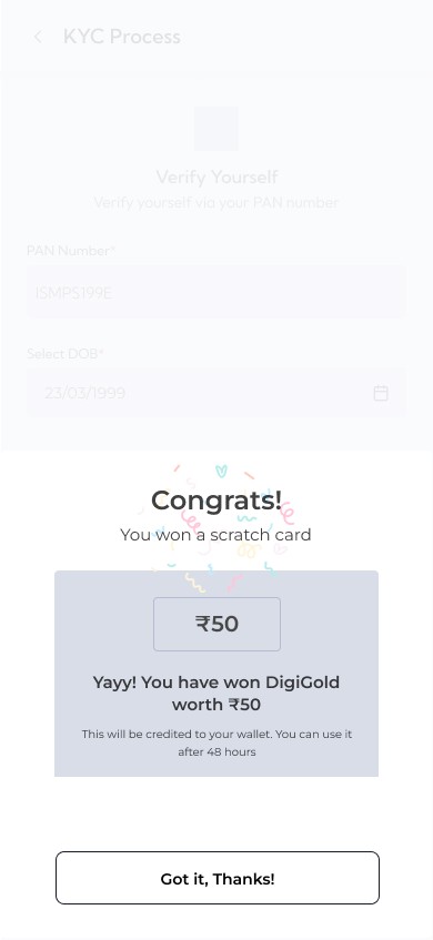
Complete KYC Section (For explore users)
Continue to complete your KYC Process
Continue CTA
Top Movers this week
Daily updates/Announcement/Event
Check these KPIs and make right Investment
KPIs like check ratios of any stock etc
Find here CTA
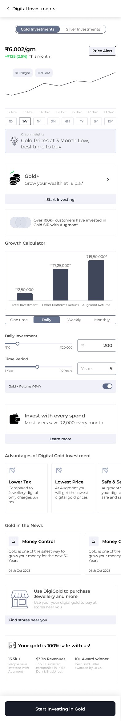
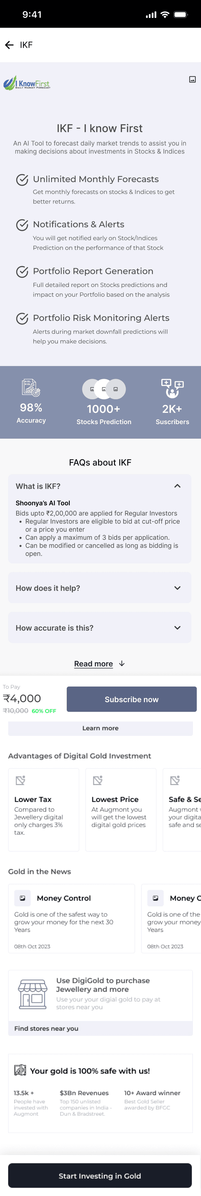
IKF (when user not subscribed)
Heading
Body Copy
no of ppl subscribed
Overall Accuracy %
Subscribe CTA
Futures and Options
Category Cards
Indices options
Indices futures
Stocks options
Stocks futures
View All CTA
Confused about where to invest?(learning content)
Video cards
Add funds - for new users
Basket section
Pre made basket by Shoonya
Create your own basket- CTA
Invest by sectors
Sectors card
View All CTA
News Section
List of News Card
Image
Heading
Source
Date & Time
Tools
Stock SIP
Basket Orders
Import Investments
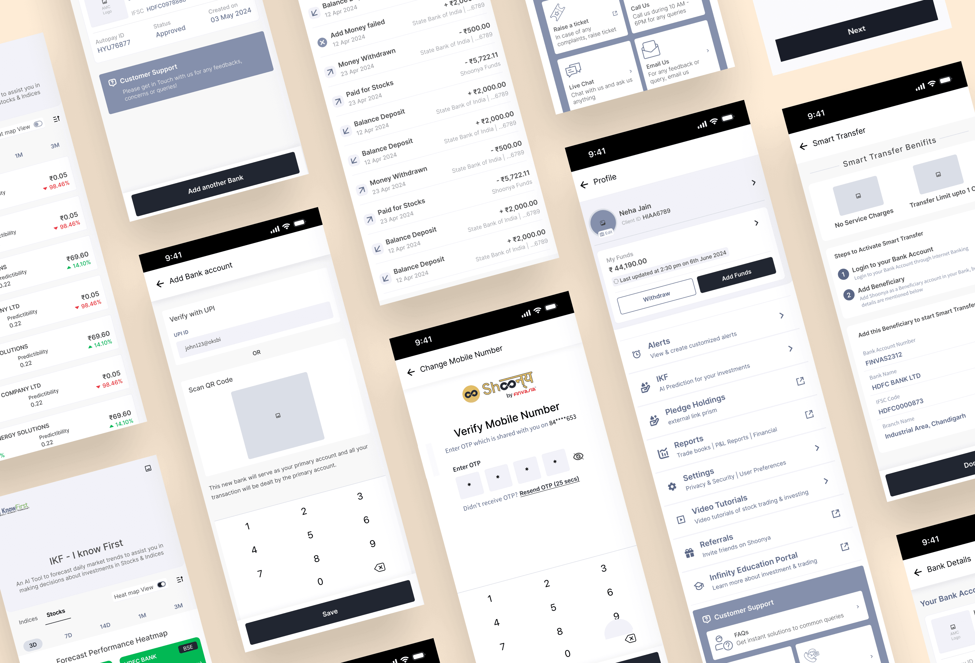
Onboarding page
Shoonya brand logo
Illustration - USPs of Shoonya
Zero Brokerage
Start investment with rs 100
Continue with google CTA
Use Other email Id
Use Apple ID(only for iphone users)
Explore Shoonya app
Walkthrough screens
Walkthrough highlighting a particular feature
Heading
Body Copy
Skip CTA
Next icon
Close icon
Log In Screen(Repeat Login)
Hi, “Name”
Enter Mpin
Use Bio Metric
Forgot Mpin CTA
Finding a Visual Style
Wireframes


UI Screens


Before & after Screen Comparison
A brief analysis of the decision taken during screen redesign
Before

After
Mutual Fund Screen Sections ( old)
UX Pain points
The screens section appears when the tab in the bottom nav is selected that leaves all the other sections hidden , hence a comprehensive understanding of the overall overview of the mutual funds cannot be done
No modern tools for calculation of Mutual funds
No section for any recommendation nudge
No effort(Section) for explaining info ( terms, process etc.) for beginners
UI Pain points
Very plain & primitive look & colour
Only icons & name, no description of the section and call to action buttons
Mutual Fund Screen Sections ( New design)
UX Solutions
A more simplified tabs has ben introduced with more compartmentalised options like explore, portfolio, orders, saved, through which the user could get a complete overview and all functionalities in an organised way.
Modern and required tools like Mutual Fund calculators & Compare MF are added for the user to get a more informed decision.
Sections like Investment ideas, popular funds etc. are added as recommendation for beginners as well as experienced investors.
A section for learning material is also added for the user learn about mutual funds
UI Pain points
Green colour has been used as a primary colour that represents growth and money
More descriptive & visually appealing sections hand holding the user to take an action
Thank You 😊
Let’s connect
Get in touch for opportunities or just to say hi!
https://www.linkedin.com/in/neha-jain-baa9b713/


MF Calculator
Monthly SIP
One - Time
SIP Amount
₹5,000
Expected return rate(p.a)
10.5%
Select Duration
2 Yr
₹2,45,734.34
+21.28%
₹65,000
₹1,80,000
₹1,96,000.00
+5.73%
₹32,000
₹1,80,000
SIP
10.5%
Fixed Deposit
6.5% p.a
Invested Amount
Return Amount
SIP
Investment of ₹1,80,000
₹2,45,734.34
(+10.05%)
Fixed Deposit
Investment of ₹1,80,000
₹2,00,125.00
(+6.5%)
Explore Mutual Funds
9:41
Overview
The Finvasia Group sought to revolutionise the fintech industry in India by enhancing their app’s UX and UI, creating a more intuitive and user-friendly app and website experience that surpasses industry standards.
My Role
UX Research
UX Design
UI Design
Type
Responsive Website
Duration
2 months
Business Type
B2B
Simplify Wealth, Amplify Growth – An app by Finserva
Redesigning a beginner friendly trading & Brokerage Experience
Problem Definition
Many trading platforms in India have high brokerage fees or complex interfaces, making trading difficult for both beginners and experienced traders.
Objectives
To create an app and website whose interface is simple and user-friendly.
To educate users who are beginners in trading with comprehensive UX writing.
To provide commission-free trading and advanced features to make investing more accessible for everyone.
Brand & Strategy Kickoff: Understanding the problems & Brand Vision
In a four-hour workshop, we quickly set brand attributes, target groups, and goals, focusing on fast decisions and strategic action.
Main USP of the app
0 Brokerage, 0 Account opening, 0 AMC
One stop solution for Foreign policy Investors
Reached from 64th position to 30th position in just a span of a year
AI Based recommendation provided via “I Know First” technology
Things tried & not worked before by the client

Challenges on the basis of a stakeholder workshop
Shoonya app is buggy and stop responding all of sudden and some time just crashed middle of entering any of option.
Easily accessible option to invest in IPO.
Alert for IPO application selection or rejection.
Refund notification in case of rejection.
Difficulty in locating the dashboard or portfolio.
Unable to start SIP.
Compare multiple MF.
Distinction between types of MF.
Portfolio score and returns for any specific period.
Required number of accounts to get good return.
Tracking errors and market liquidity concerns.
Interest rate fluctuations impacting bond values.
Difficulty in moving from screen to screen
The app is buggy, stops responding and crashes randomly
Users are unable to see key data points of a stock while investing, this makes it difficult to make a decision in time
Not having a informative dashboard in order to get insights on market trends
UI is clumsy
Difficulty in navigating
Users are not sure about liquidity conditions for Government & Co-operate Bonds, ETFs, Government Securities and Mutual Funds
Brand Vision
1 year Brand vision
Aim to become one of the top 10 brokerage firms in India, impacting the financial landscape positively, with millions of users benefiting from our services by leveraging a user-friendly design, cost effective and extensive outreach strategies.
KPIs & Goal Setting
UX Research
UX Audit
User Interview
UX Strategy
Competitor Analysis
Feature Mapping
Analysis of Target Group
Persona Creation
User Journey Mapping
Information Architecture
Sitemap
Task Flow
Finding a Visual style
Wireframes
UI Screens
Prototyping
UX Research
UX Audit was conducted to
Identify usability issues affecting user satisfaction.
Improve engagement and conversion rates.
Ensure accessibility and inclusivity.
Enhance efficiency.
Align with user needs and business goals.
User Interviews
Conducted & Analyse interviews with potential users and existing users.
UX Strategy
Current State
Outdated Design
Insufficient & confusing information
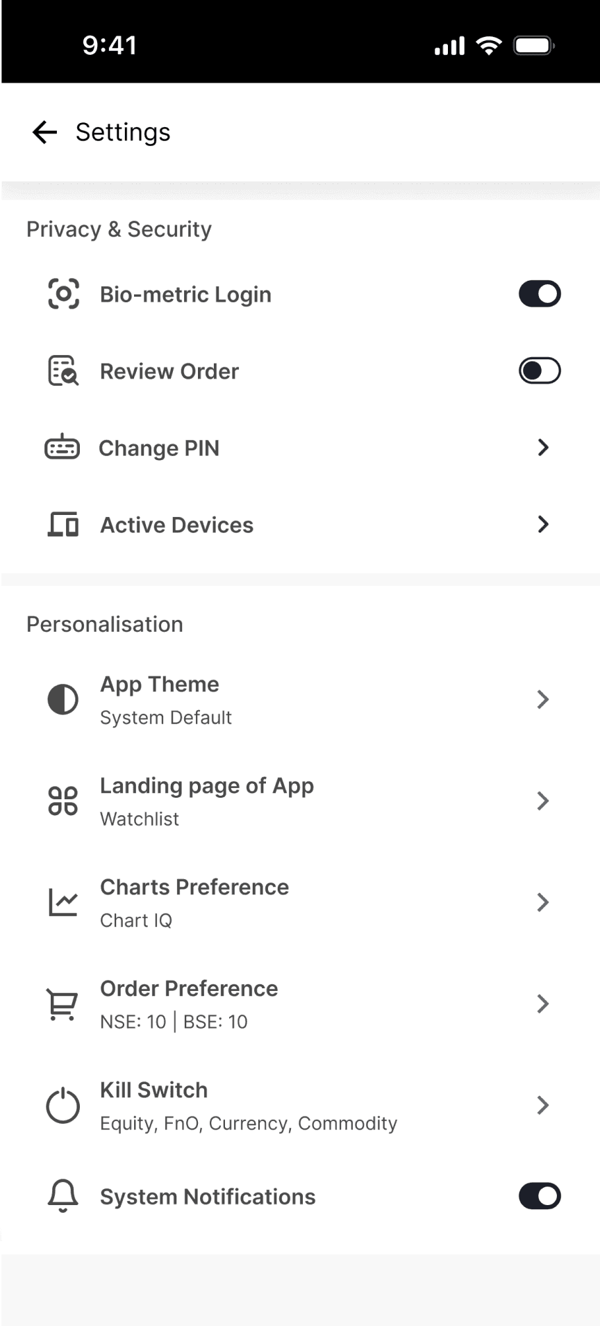
Settings Reset
Lack of Tech & Design optimization
Discoverability issue
Limited functionalities within features
Drivers
Visual Appeal
Information & Details
Convenience
Reliability
Brand Reach
User Experience
Barriers
Heavy cognitive load
Placement & lack of information
Repetitive Actions
Technical Limitations
Highly competitive landscape
Frustrating User Flow
Future State
Visually appealing & intuitive
Comprehensive knowledge resources
Preserve user settings & information
Stable & reliable platform
Becoming leading broker platform
Enhanced User Engagement & satisfaction
Challenges
Users were not comfortable in sharing information.
Focus Area
Simple and Minimalistic design
Improving navigation
Reduce cognitive load
Gamification
Portfolio Management
App engagement
Aspirations
Enhanced product features and functionalities
One-stop solution for Investments
Streamlined navigation
Easy adaptability for new users
High User Retention
Enhanced User Satisfaction
Key Activities
Advance Chart Functionalities
Notification System
Watchlist Saving
Device Restrictions
Simplify order placements
Targeted Nudges for Engagement
Personalised Recommendations
Competitors Analysis & Feature Mapping
Features
GTT Feature
Data Visualisation
One Click Trading
Comparing funds
Different payment modes
Loan on the basis of portfolio
0 Brokerage fee
Our App
✅
—
✅
—
—
✅
✅
Kite(Zerodha)
✅
✅
✅
—
✅
✅
—
✅
—
✅
✅
✅
—
—

Angel One
✅
—
✅
—
✅
✅
✅
Research Findings & Possible Solutions
PROBLEMS
Hidden Fees
Most trading platforms charge hidden fees and fail to communicate their pricing structures.
SOLUTIONS
Transparent Fee Structure
To attract new users, communicate the zero brokerage feature on the platform's homepage and during onboarding. Provide detailed information about other potential fees or charges to ensure transparency and build user trust.
PROBLEMS
Difficult to understand language
Beginners find it hard to understand the complicated language used on fintech platforms, which makes them less enthusiastic about using the platform ahead.
SOLUTIONS
Avoid Information Overload
To cater to users who value simplicity and transparency, offer basic market updates and present information clearly within the platform. Highlight key features, relevant market updates, and educational resources.
PROBLEMS
Inefficient portfolio management
Most fintech platforms don’t offer personalised portfolio management features; hence, there is almost no platform loyalty from the users' side.
SOLUTIONS
Effective Portfolio Management
Enhance portfolio management tools within the Shoonya platform to encourage users to consolidate their investment activities. Offer features for tracking portfolio performance, monitoring asset allocation, and managing investment goals to streamline the user experience.
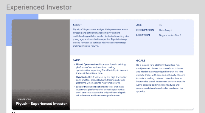
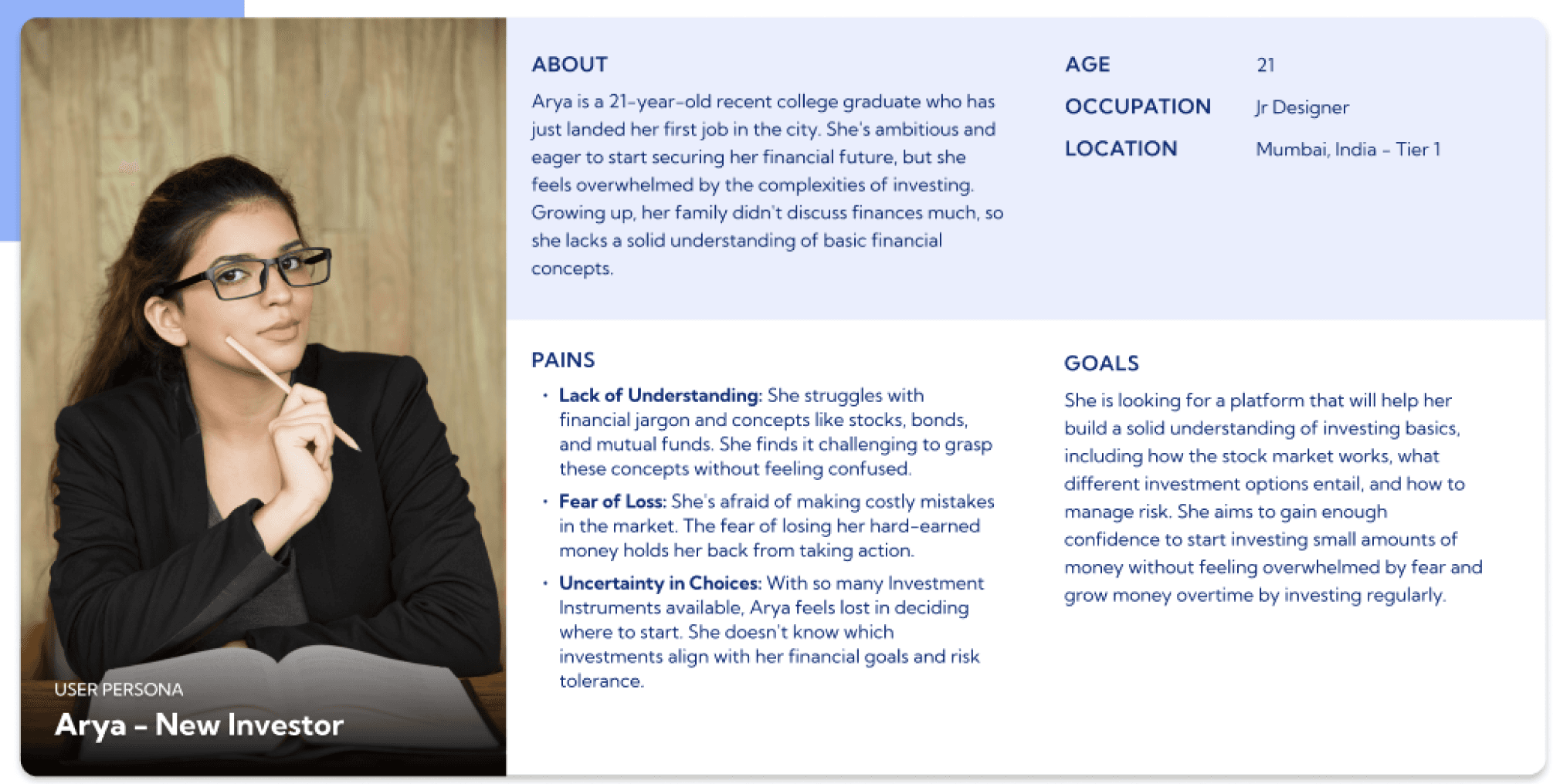
Analysis of Target Group
User Personas
With the data & takeaways we received from the user research, user personas and use cases were created.

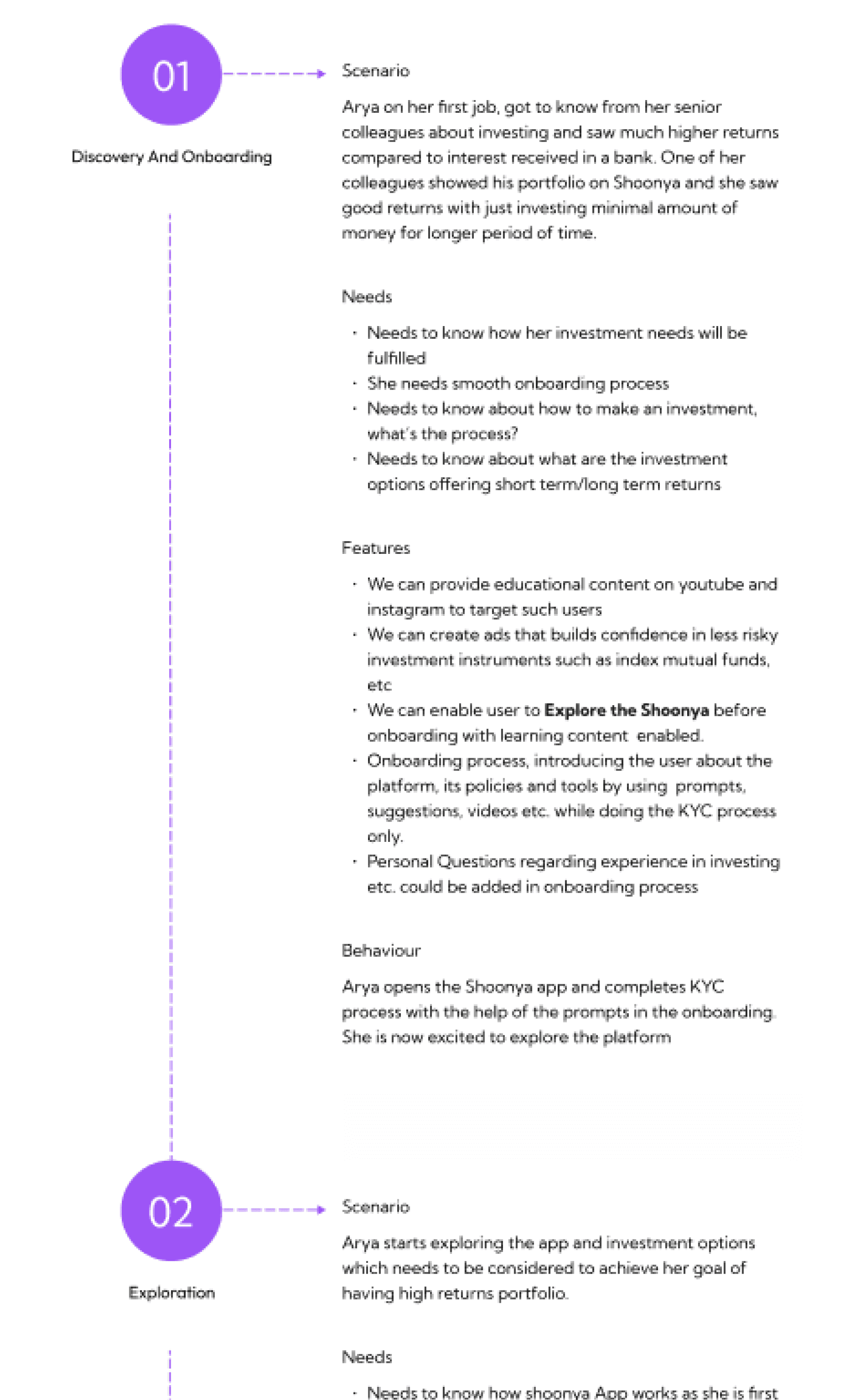
Use Case Scenarios
How will the user interact with our platform
Emotion-Driven User Flow
What is each milestone communicating?
Onboarding
Transaction Complete
Overview
Browsing
KYC
Add to wallet
Selection
Mobile Number
OTP
Scrolling through options
Viewing information
Viewing services
Reading FAQs & article
Personal Information
Bank Details
Address
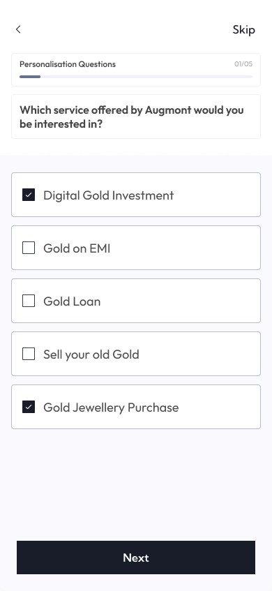
Investment options users is interested in
Adding funds
Entering bank details
Verifying
Redirected to payment gateway
Selecting the investment option
Set quantity & other details
Adding to cart
Final Confirmation
Tracking and next steps if any
Portfolio overview
Invested amount and returns
Anxious
Confused
Overwhelmed
Relief
Information Architecture
Task Flows

Sitemap
Stocks (Home Page)
All Indices (horizontal scrolling)- clickable
Indices card
Name
Value (green or red)
Negative or positive amount
Search Bar
Upcoming IPO’s
IPO Cards
View All CTA
Complete KYC Section (For explore users)
Continue to complete your KYC Process
Continue CTA
Top Movers this week
Daily updates/Announcement/Event
Check these KPIs and make right Investment
KPIs like check ratios of any stock etc
Find here CTA
IKF (when user not subscribed)
Heading
Body Copy
no of ppl subscribed
Overall Accuracy %
Subscribe CTA
Futures and Options
Category Cards
Indices options
Indices futures
Stocks options
Stocks futures
View All CTA
Confused about where to invest?(learning content)
Video cards
Add funds - for new users
Basket section
Pre made basket by Shoonya
Create your own basket- CTA
Invest by sectors
Sectors card
View All CTA
News Section
List of News Card
Image
Heading
Source
Date & Time
Tools
Stock SIP
Basket Orders
Import Investments
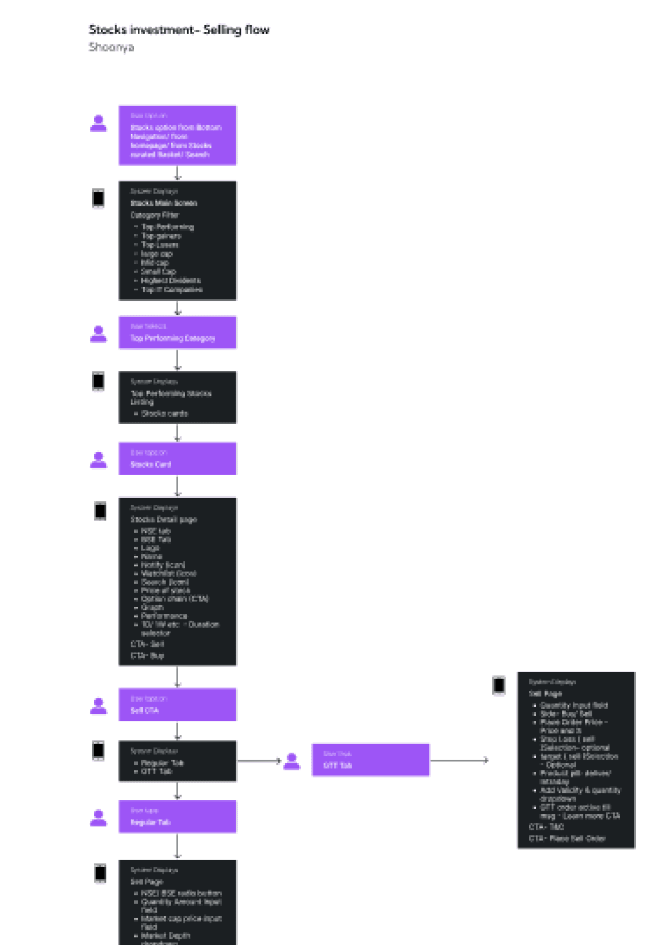
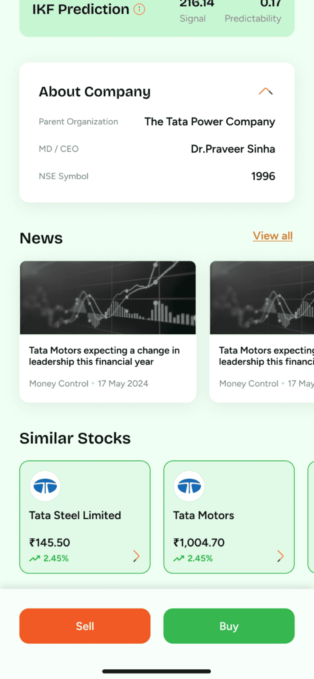
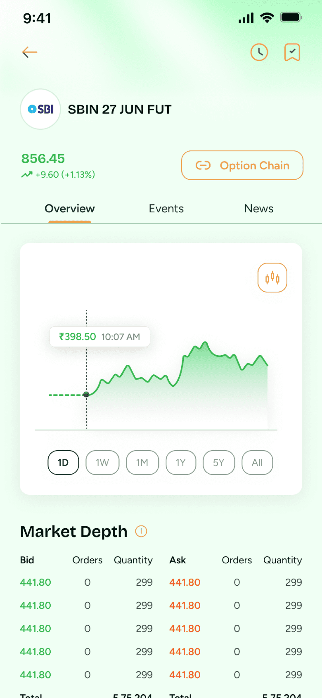
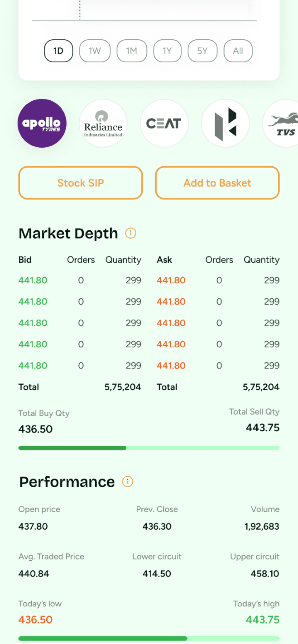
Stock Detail Page
Name of the Stock
NSE-BSE toggle is only for both exchanges
Current Price
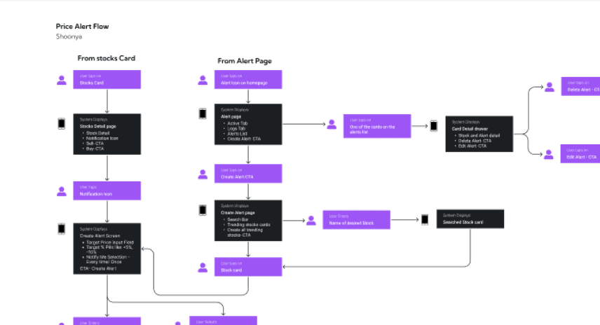
Price Alert icon
Add to watchlist icon
Download Stock card
Graph Line chart with option to view candle stick as well
Filters like 1d, 1w, 1m etc
Live price indicator
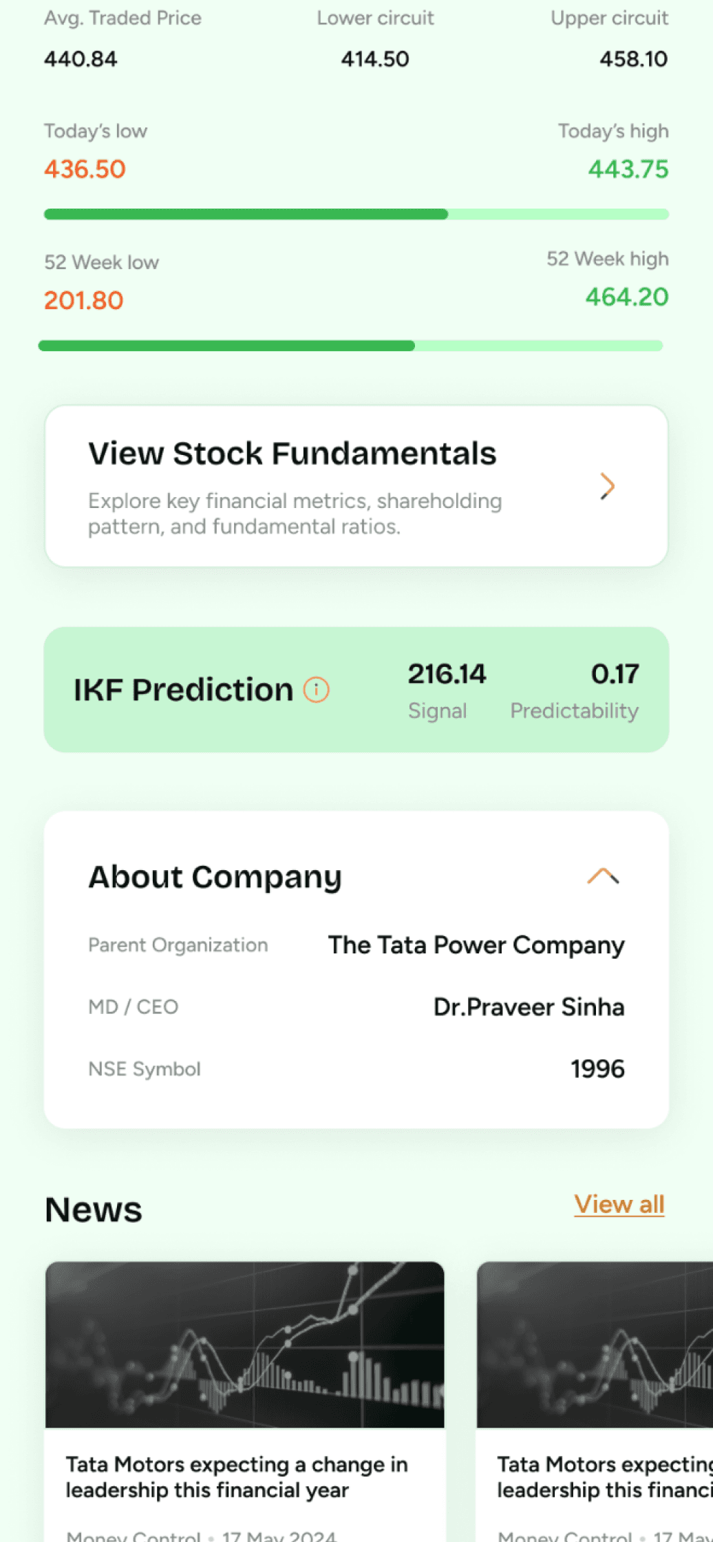
Today’s low and high
52 week low and high
View in full screen
Overview tab
Fundamentals tab
Events tab
News tab
Onboarding page
Shoonya brand logo
Illustration - USPs of Shoonya
Zero Brokerage
Start investment with rs 100
Continue with google CTA
Use Other email Id
Use Apple ID(only for iphone users)
Explore Shoonya app
Bottom Navigation
Stocks
Watchlist
Mutual Funds
Portfolio
Orders
Top Bar
Shoonya Logo
Notifications
News
Profile
Walkthrough screens
Walkthrough highlighting a particular feature
Heading
Body Copy
Skip CTA
Next icon
Close icon
Log In Screen(Repeat Login)
Hi, “Name”
Enter Mpin
Use Bio Metric
Forgot Mpin CTA
Finding a Visual Style
Wireframes
What is each milestone communicating?
UI Designs & components
What is each milestone communicating?
Typography
Bricolage Grotesque
ABCDEFGHIJKLMNOPQRSTUVWXYZ
ABCDEFGHIJKLMNOPQRSTUVWXYZ
0123456789
Figtree
ABCDEFGHIJKLMNOPQRSTUVWXYZ
ABCDEFGHIJKLMNOPQRSTUVWXYZ
0123456789
#082F25
#EFA145
#DEFFE6
#424242
#EFEFEF
#D17800
#6CE890
#ABCEB7
UI Screens
What is each milestone communicating?
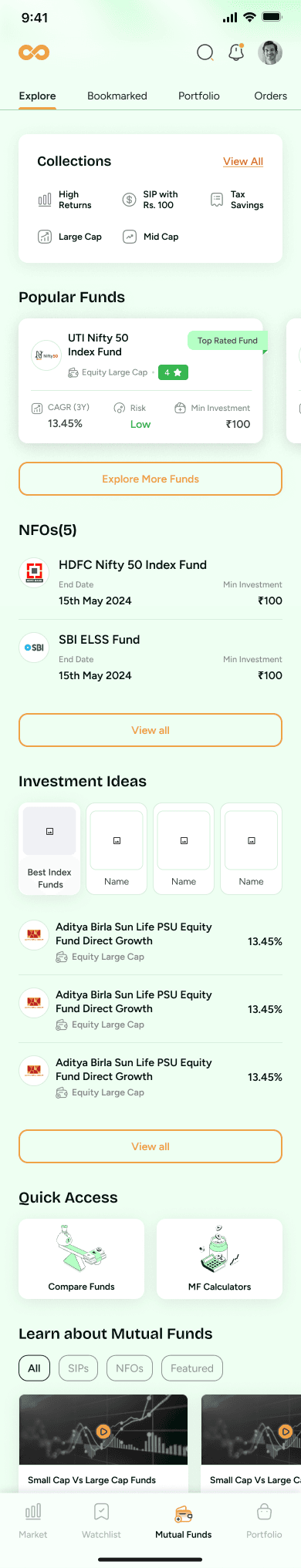
Explore
Bookmarked
Portfolio
Orders
Collections
View All
High Returns
SIP with Rs. 100
Tax Savings
Large Cap
Mid Cap
Popular Funds

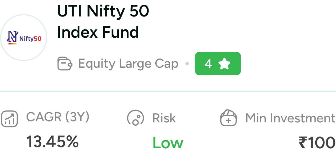
UTI Nifty 50 Index Fund
Equity Large Cap
4
CAGR (3Y)
13.45%
Risk
Low
Min Investment
₹100
Top Rated Fund
UTI Nifty 50 Index Fund
Equity Large Cap
4
CAGR (3Y)
13.45%
Risk
Low
Min Investment
₹100
Top Rated Fund
Top Rated Fund
Explore More Funds
NFOs(5)
View all

HDFC Nifty 50 Index Fund
End Date
15th May 2024
Min Investment
₹100

SBI ELSS Fund
End Date
15th May 2024
Min Investment
₹100
View all
View all
Investment Ideas
View all
Best Index
Funds
Name
Name
Name

Aditya Birla Sun Life PSU Equity
Fund Direct Growth
Equity Large Cap
13.45%
Aditya Birla Sun Life PSU Equity
Fund Direct Growth
Equity Large Cap
13.45%
Aditya Birla Sun Life PSU Equity
Fund Direct Growth
Equity Large Cap
13.45%
Quick Access

Compare Funds
MF Calculators
Learn about Mutual Funds
All
SIPs
NFOs
Featured

Small Cap Vs Large Cap Funds
Source IND Money
1 min
Small Cap Vs Large Cap Funds
Source Mint
1 min

9:41
Market
Watchlist
Mutual Funds
Portfolio
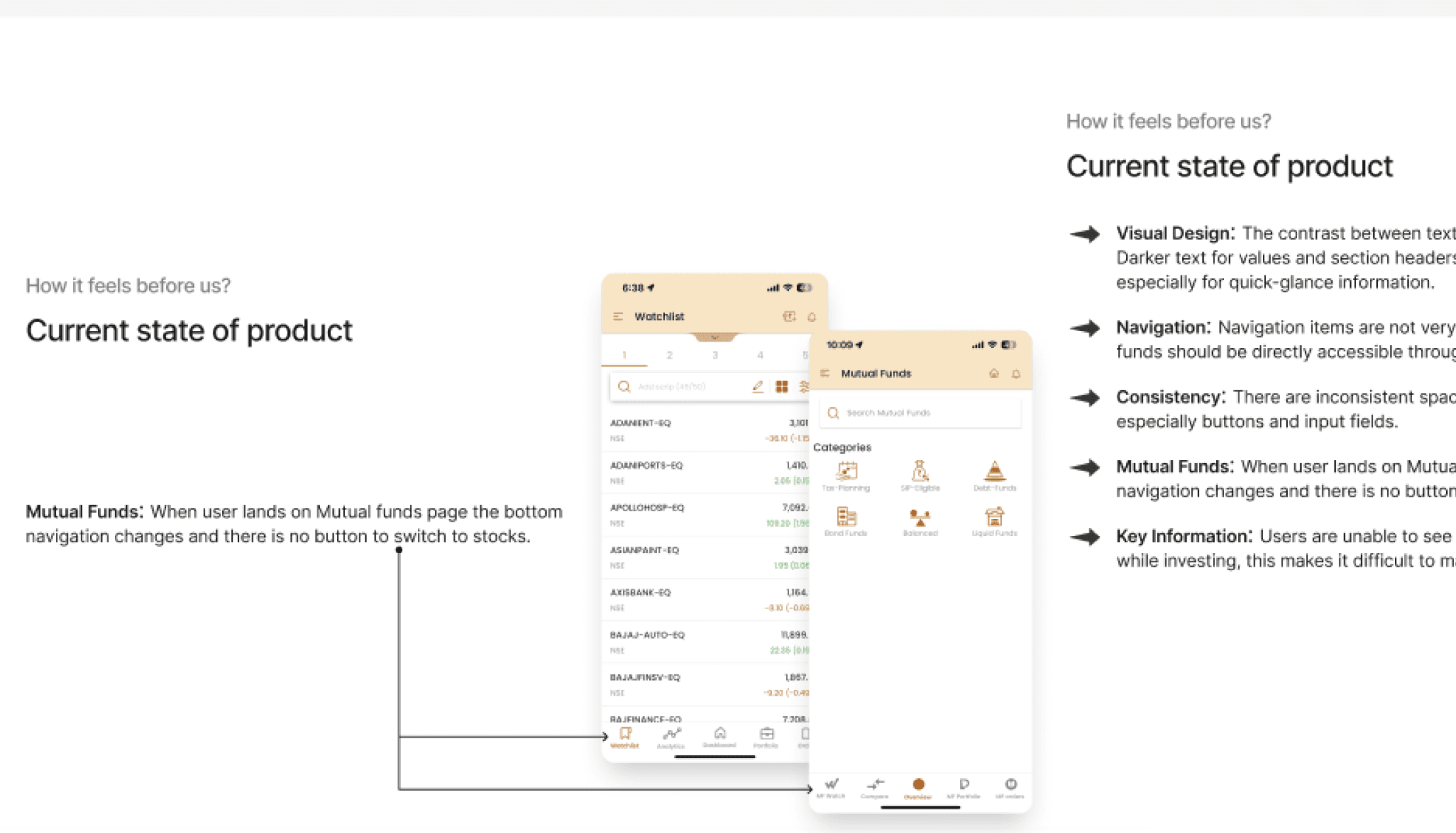
Before & after Screen Comparison
A brief analysis of the decision taken during screen redesign
Mutual Fund Screen Sections ( old)
UX Pain points
The screens section appears when the tab in the bottom nav is selected that leaves all the other sections hidden , hence a comprehensive understanding of the overall overview of the mutual funds cannot be done
No modern tools for calculation of Mutual funds
No section for any recommendation nudge
No effort(Section) for explaining info ( terms, process etc.) for beginners
UI Pain points
Very plain & primitive look & colour
Only icons & name, no description of the section and call to action buttons
Mutual Fund Screen Sections ( New design)
UX Solutions
A more simplified tabs has ben introduced with more compartmentalised options like explore, portfolio, orders, saved, through which the user could get a complete overview and all functionalities in an organised way.
Modern and required tools like Mutual Fund calculators & Compare MF are added for the user to get a more informed decision.
Sections like Investment ideas, popular funds etc. are added as recommendation for beginners as well as experienced investors.
A section for learning material is also added for the user learn about mutual funds
UI Pain points
Green colour has been used as a primary colour that represents growth and money
More descriptive & visually appealing sections hand holding the user to take an action
Bottom Navigation ( old)
UX Pain points
No Universal & persistent Bottom navigation
Every page had a separate bottom nav as per the page acting as a a tab.
Bottom Navigation ( New design)
UX Solutions
A common bottom navigation was incorporated easing user to navigate through the main modules
UI Pain points
More sleek & understandable icons were added for the user to understand in a better way
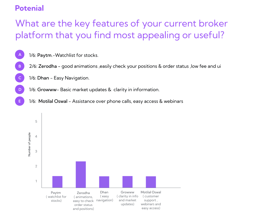
Rishav
Client
We wanted a design agency with extensive fintech and BSFI product experience, so we interviewed companies like Lollypop. Still, Kishore’s knowledge and understanding of fintech products convinced us to work with Yellow Slice. The team's designers didn’t need constant nudging and knew what they wanted to do to create a better UI and UX design. We were the happiest with the research part of the project.
Thank You
Let’s connect
Get in touch for opportunities or just to say hi!
https://www.linkedin.com/in/neha-jain-baa9b713/