

Bajaj - Humara Mall
Designing Effortless Everyday Commerce
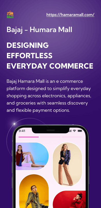
Bajaj Hamara Mall is an e commerce platform designed to simplify everyday shopping across electronics, appliances, and groceries with seamless discovery and flexible payment options.
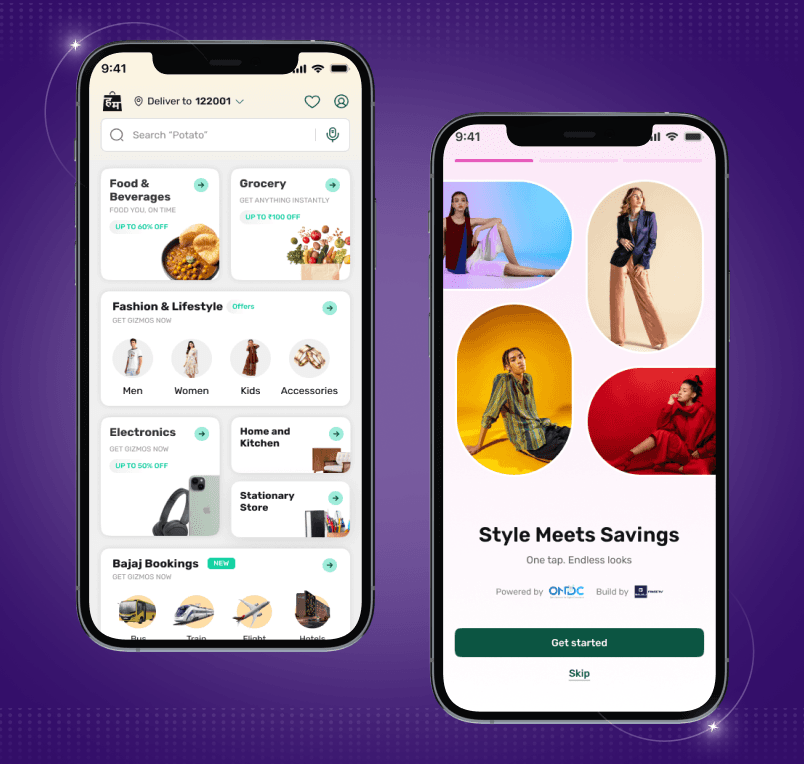
Project Overview
This Project focused on building the Humara Mall mobile app and website, aligning a modern digital experience with intuitive interaction design & enterprise grade usability standards.
Industry Type
E commerce
services provided
UI Design
PLATFORMS
Mobile app and Website
BUSINESS TYPE
B2C
Problem Statement
The platform’s experience was fragmented due to inconsistent visual hierarchy and poorly structured user flows, resulting in cognitive friction across key tasks. Navigation inefficiencies and an outdated interface further limited its ability to drive engagement and sustained user adoption.
Objectives
Build a user friendly and scalable retail platform.
Ensure design consistency through a modular system.
Introduce engaging visuals and interactions to improve the experience.
Deliver within a tight project timeline without compromising quality.
Discover & Define
I began by conducting structured conversations with cross functional stakeholders, product designers, UX leads and front end engineers across various product teams of Bajaj.
Audit of existing brand guidelines & Audit of local Figma libraries was conducted
Key Pain Points Identified
Multiple design libraries created confusion
Designers had access to several libraries at the same time, making it unclear which components were the correct or latest versions to use.
UI Designer
Low component reusability across projects
Due to uncertainty around shared assets, designers often created components locally within project files instead of reusing existing ones.
Front End developer
Misalignment between design and development
Many components lacked clear documentation for states, behaviours and interactions, leading to inconsistencies during implementation.
Front End developer
Solutions & Key Outcomes
01
Centralized multiple libraries into a single design system.
02
Created reusable components to reduce repeated work.
03
Defined clear interaction and state guidelines.
04
Organised components with structured hierarchy and naming.
Project Overview
This Project focused on building the Humara Mall mobile app and website, aligning a modern digital experience with intuitive interaction design & enterprise grade usability standards.
Industry Type
E commerce
services provided
UI Design
PLATFORMS
Mobile app and Website
BUSINESS TYPE
B2C
Problem Statement
The platform’s experience was fragmented due to inconsistent visual hierarchy and poorly structured user flows, resulting in cognitive friction across key tasks. Navigation inefficiencies and an outdated interface further limited its ability to drive engagement and sustained user adoption.
Objectives
Build a user friendly and scalable retail platform.
Ensure design consistency through a modular system.
Introduce engaging visuals and interactions to improve the experience.
Deliver within a tight project timeline without compromising quality.
Discover & Define
I began by conducting structured conversations with cross functional stakeholders, product designers, UX leads and front end engineers across various product teams of Bajaj.
Audit of existing brand guidelines & Audit of local Figma libraries was conducted
Key Pain Points Identified
Multiple design libraries created confusion
Designers had access to several libraries at the same time, making it unclear which components were the correct or latest versions to use.
UI Designer
Low component reusability across projects
Due to uncertainty around shared assets, designers often created components locally within project files instead of reusing existing ones.
Front End developer
Misalignment between design and development
Many components lacked clear documentation for states, behaviours and interactions, leading to inconsistencies during implementation.
Front End developer
Solutions & Key Outcomes
01
Centralized multiple libraries into a single design system.
02
Created reusable components to reduce repeated work.
03
Defined clear interaction and state guidelines.
04
Organised components with structured hierarchy and naming.
Design & Validate
Before the final Design phase, a detailed plan with an estimated timeline was established.
01
Definition & Foundation
02
Design System Creation
03
Handover & Maintenance Guidelines
Design & Validate
Before the final Design phase, a detailed plan with an estimated timeline was established.
01
Definition & Foundation
The UI design brought our ideas to life. Our designers selected UI elements like colours, typography, and a design system aligned with the research and UX recommendations. Another thing we kept in mind was compliance with the brand identity.
Design System Principles
The design principles focused on creating clear, intuitive, and scalable experiences through structured layouts, reusable patterns, visual consistency, and action oriented interactions that simplify user decision making.
Design Creation Principles
Clear Compartment
Easily distinguishable separators within and outside components to help the user understand where one section ends and another begins. Ex - Gutter space between components and margin & spacing within components have been clearly defined in the library.
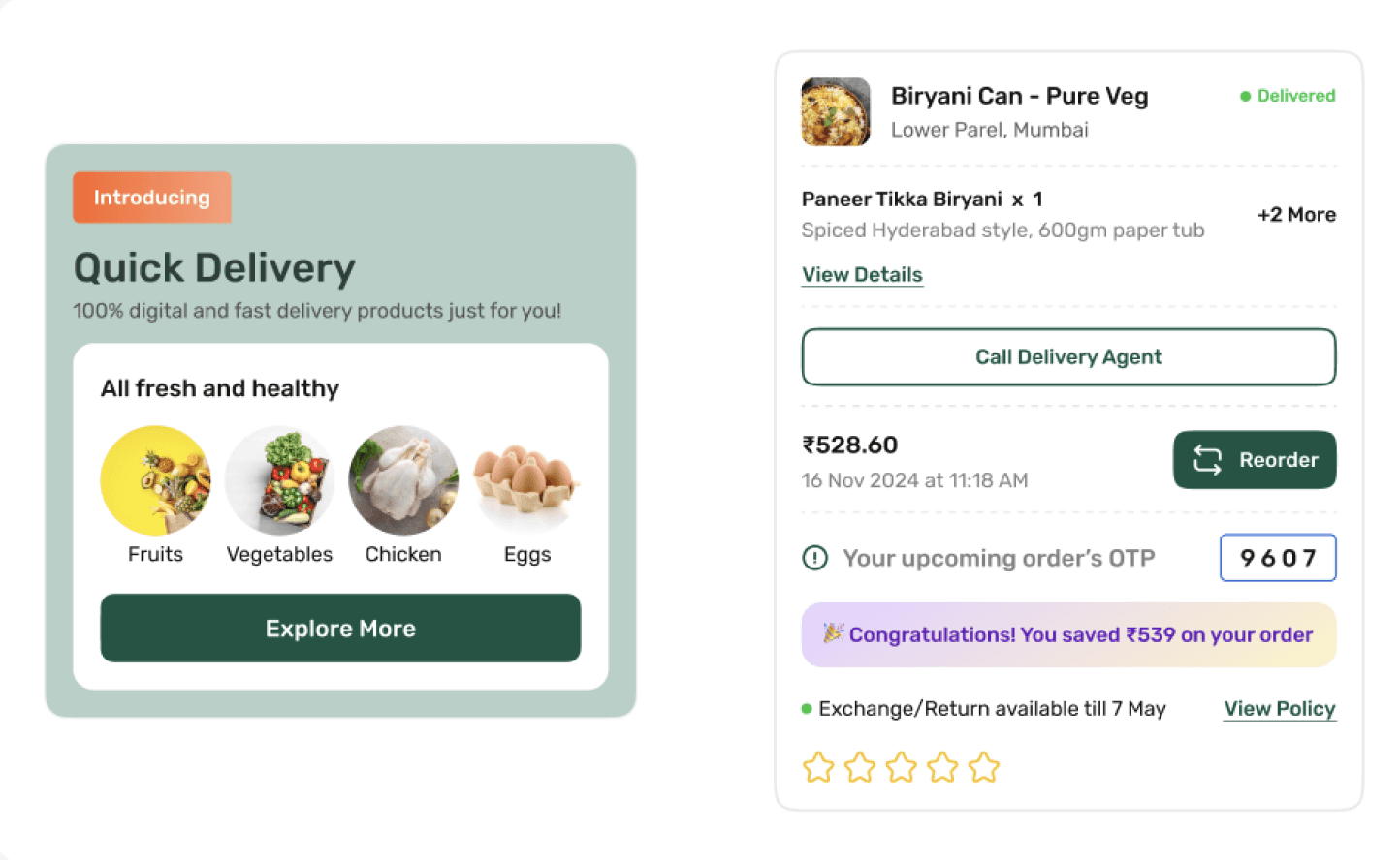
Design Creation Principles
Consistency at Scale
Reusable patterns and standardized interaction behaviors were established to maintain visual and functional consistency across multiple products.
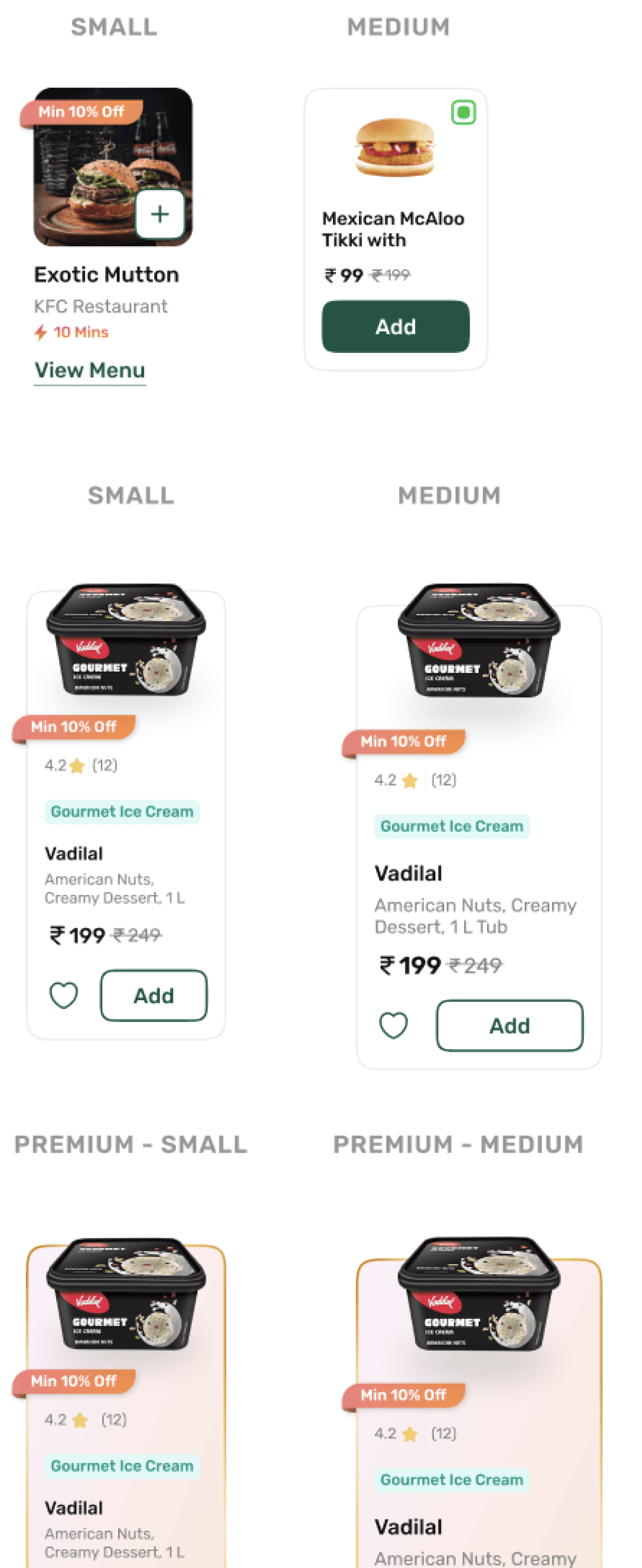
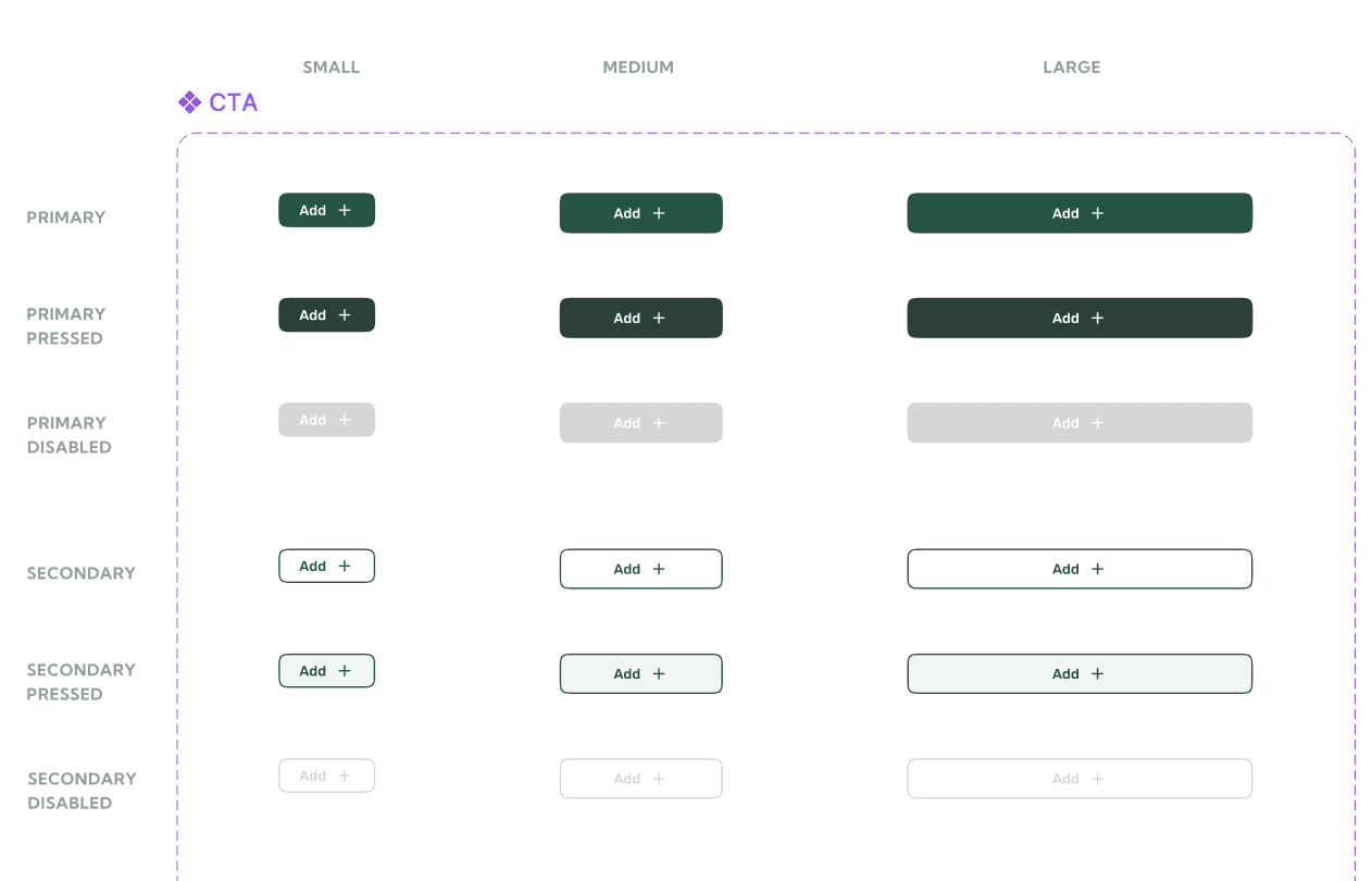
Design Application Principles
Clear Calls-to-Action
Short and visible CTAs that guide users effectively toward purchases.
Design System Structure
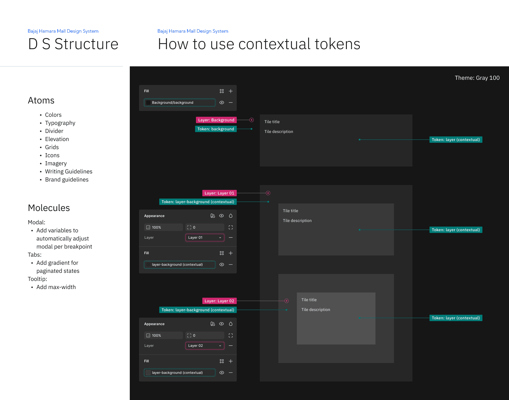
Structured a centralised Figma master library using Atomic Design principles, complemented with system guidelines, UX wireframe kits and component documentation to improve discoverability, consistency and efficiency across the design system
02
Design System Creation
To ensure consistency across the interface, the design system is built on a structured design token architecture that defines the visual foundation of the UI.
Color System
The color system is based on functional tokens rather than static values, allowing components to adapt across different contexts.
Token structure:
element.tone.emphasis.state
This approach improves clarity, simplifies usage, and ensures accessibility compliance across light and dark environments.

Typography
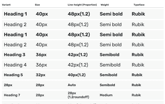
Ensures readability, sets tone, and maintains harmony with other design elements, influencing the overall structure and user experience
Heading
These are used in Headings across components. To maintain hierarchy, these can be used wherever required.
Subheadings
These are used in subheadings, labels across components. To maintain hierarchy, these can be used wherever required.
Body Text /line height
These are used for the following:
Body Text | Captions | Comments | Feedback | Product Description..........
Illustrations & Icons
Created a unified brand experience by providing clear, consistent visual metaphors that enhance usability and familiarity across the product
Isometric Icons

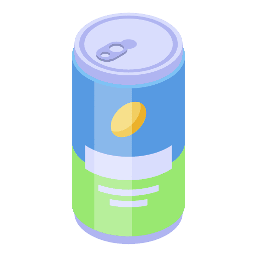






Image style Illustrations

Consistency with Unified Style, Grid alignment, Proportional Scale
Simplicity & clarity with minimal details, recognisability, Abstract forms
Contextual Relevance with funcytional icons& Emotive illustrations
03
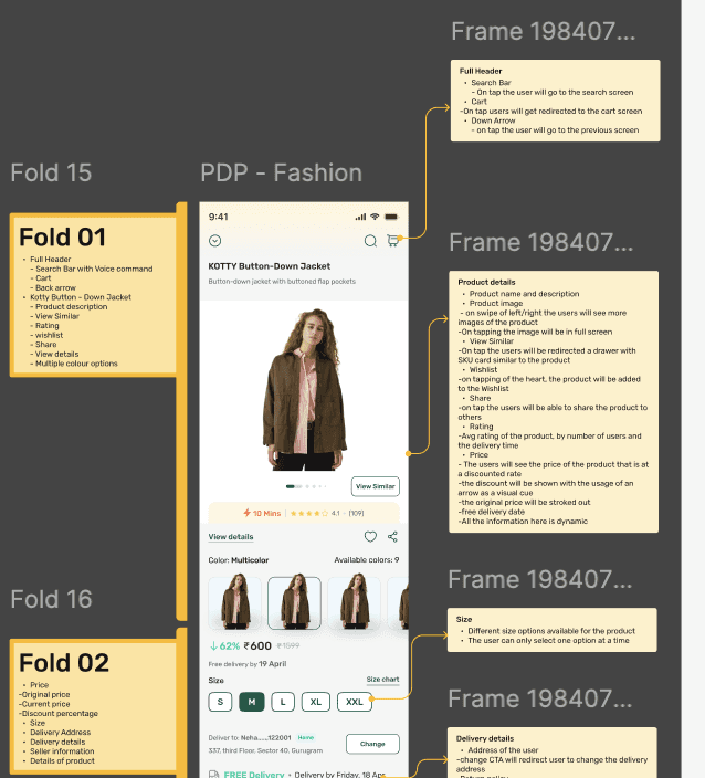
Design Documentation & Maintenance Guidelines
Built to ensure consistency, enable scalability & support long term product success across teams.
Clear Documentation to reduce ambiguity, accelerates onboarding & becomes the single source if truth
For designers, developers, product managers and stakeholders who maintain Bajaj’s Digital Experience
Maintained through defined roles, version controls, contribution process and regular review to keep the system reliable & up to date
Handoff - Icon measure
32PX
Type
32PX
Type
24PX
Type
24PX
Type
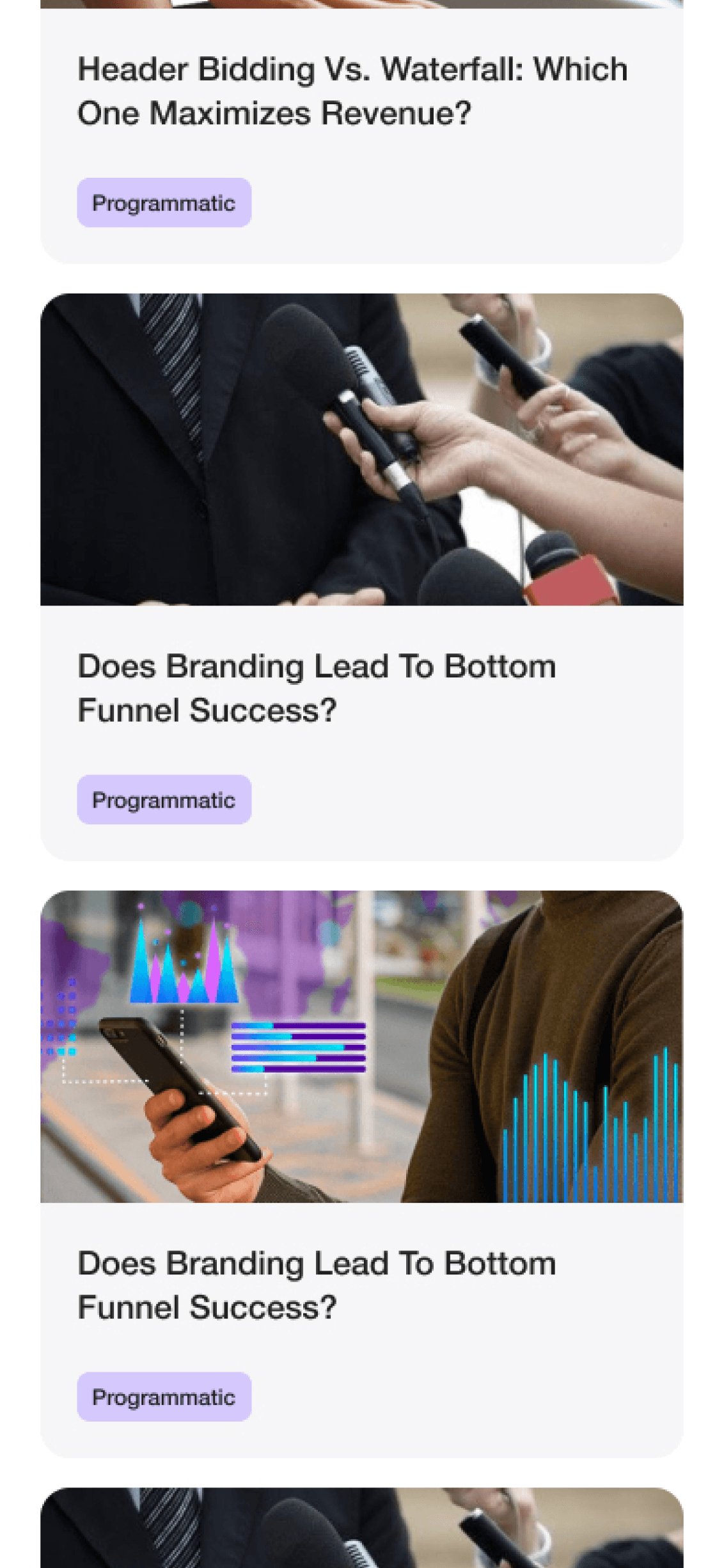
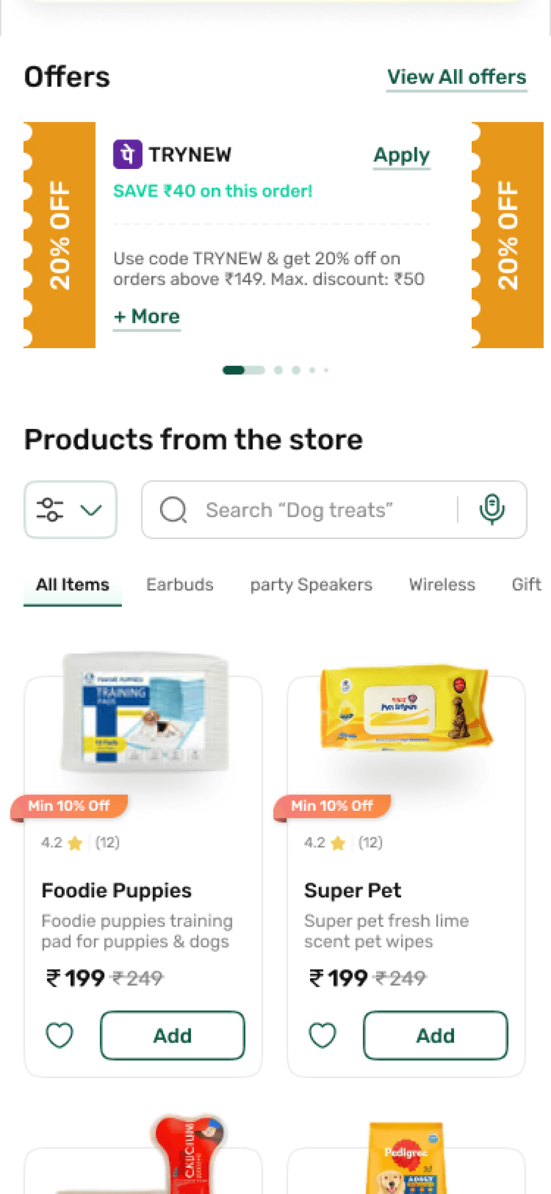
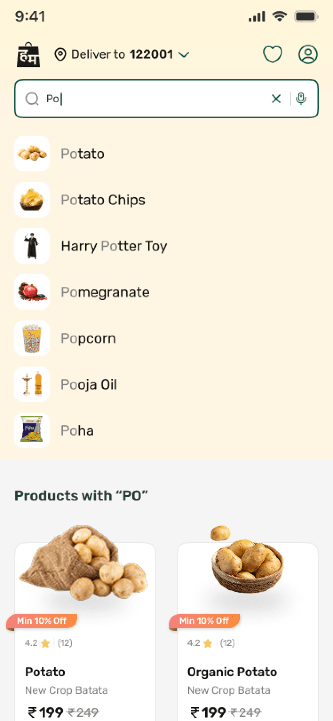
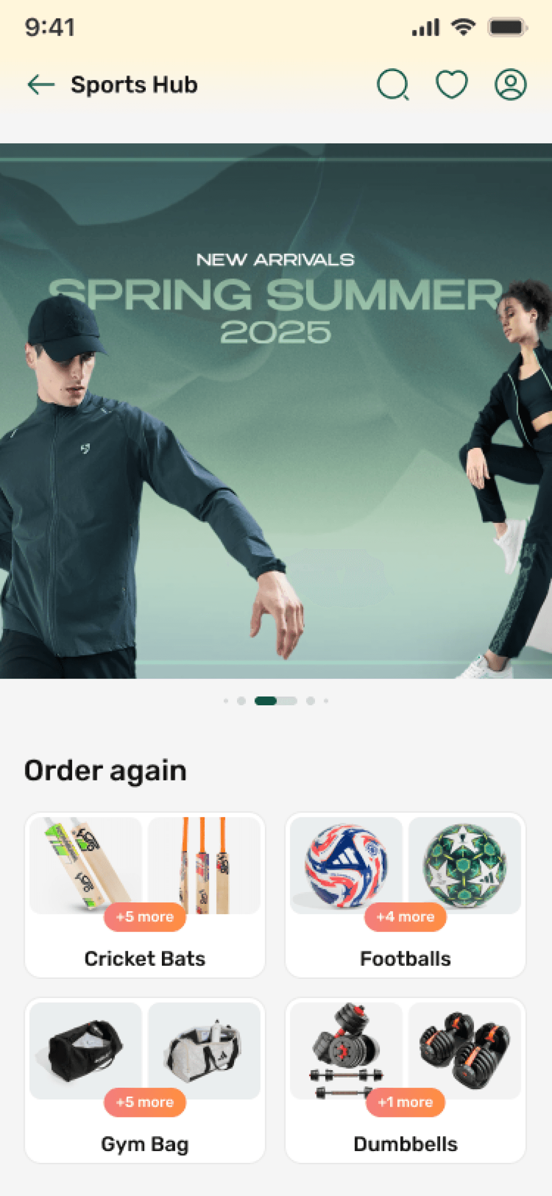
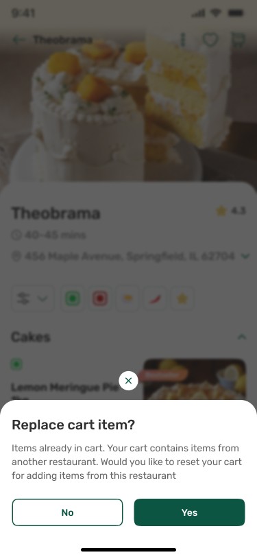
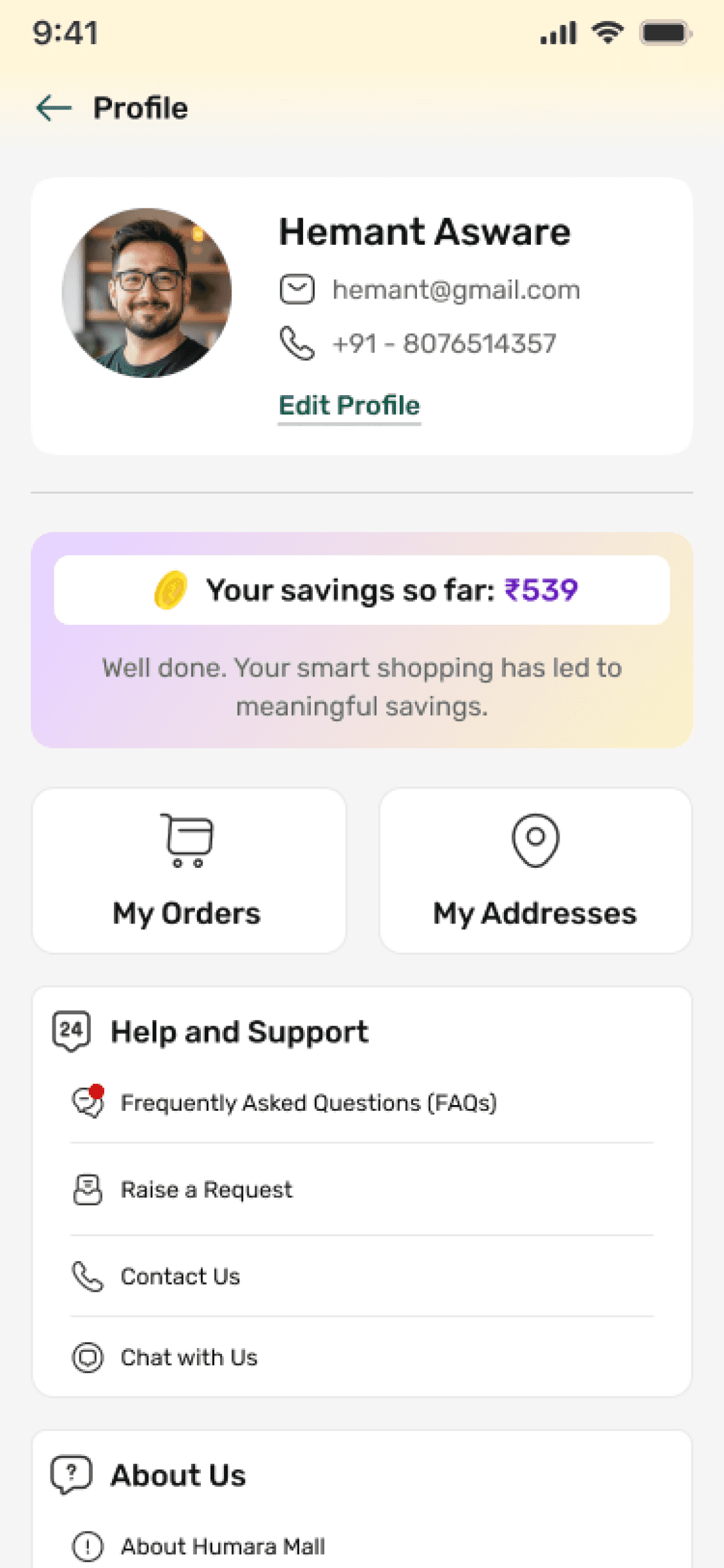
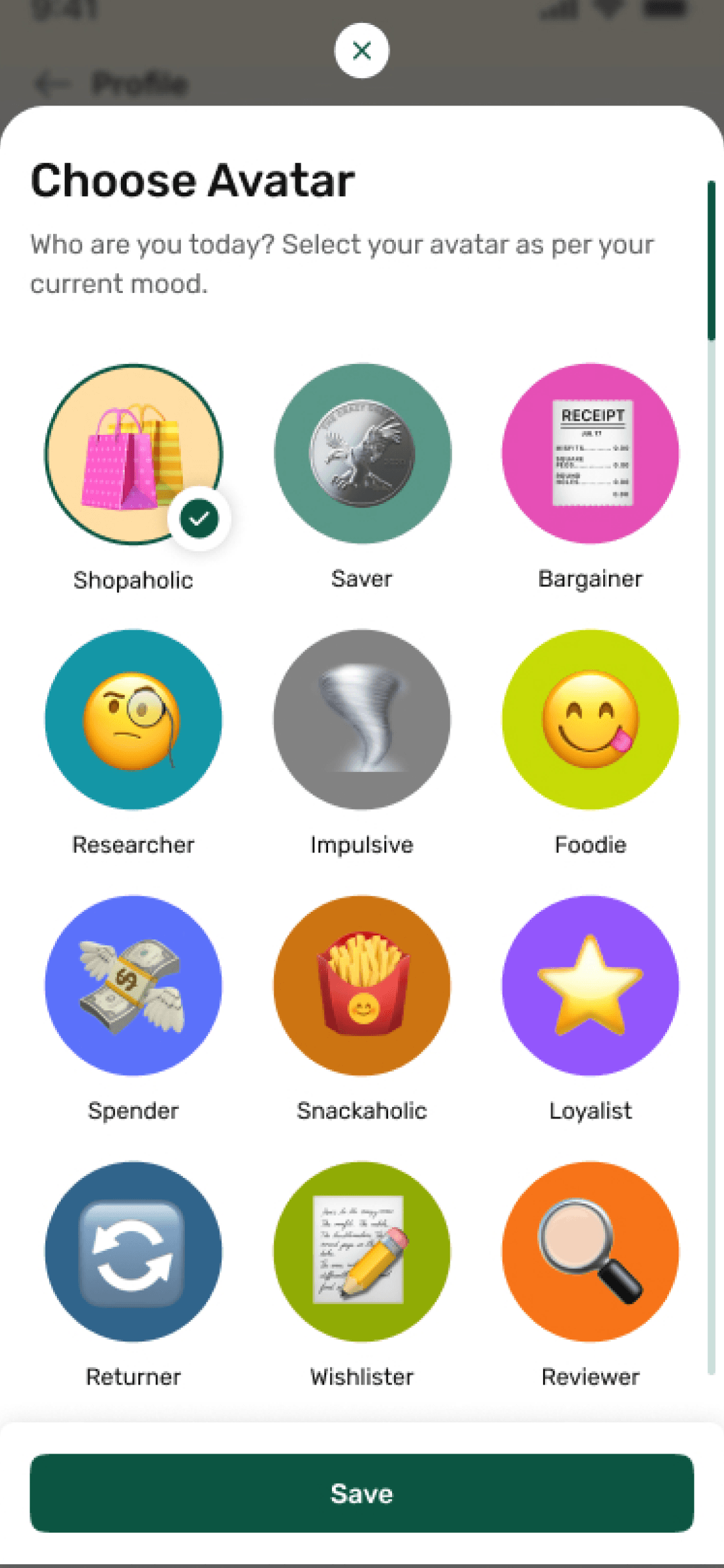
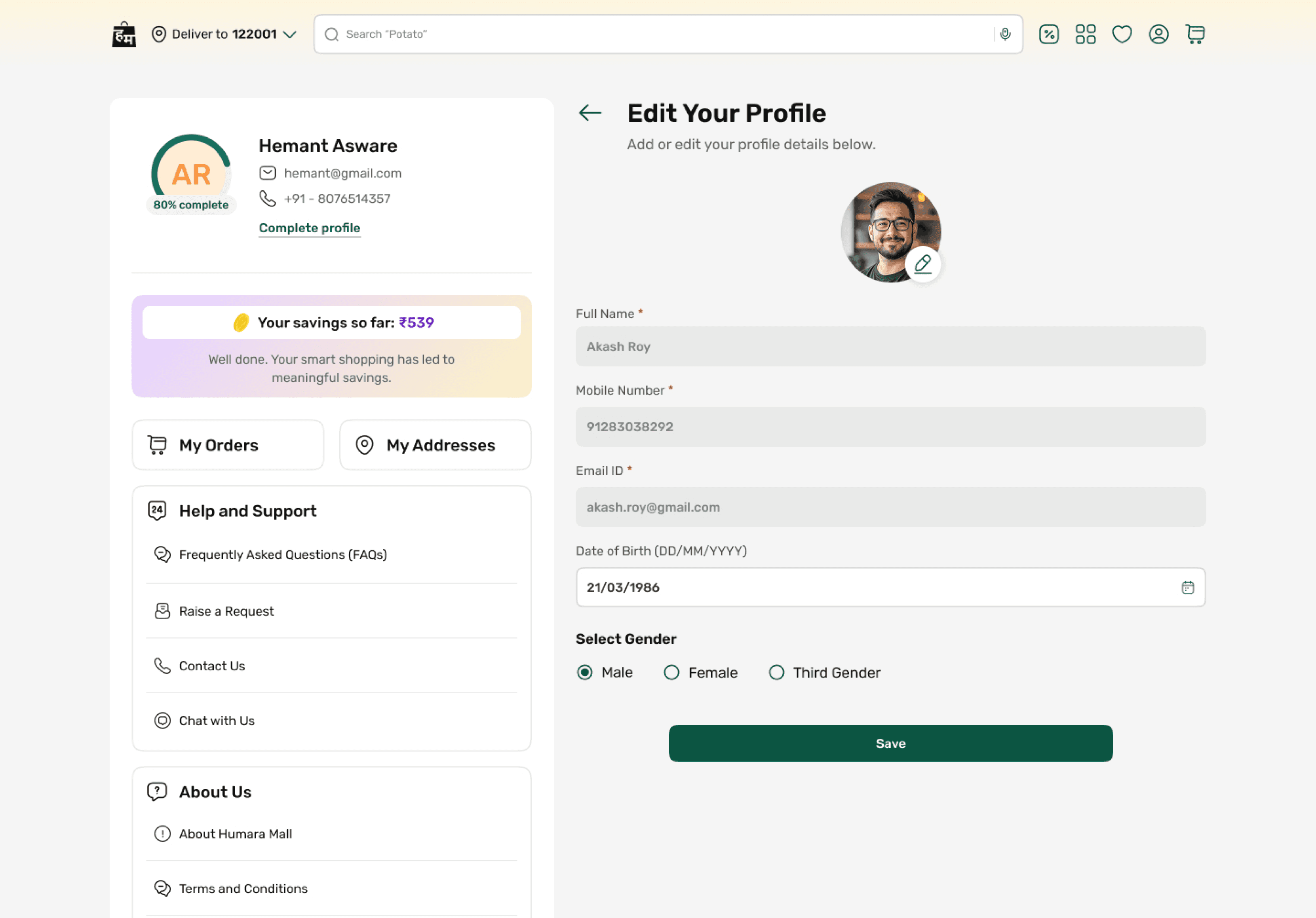
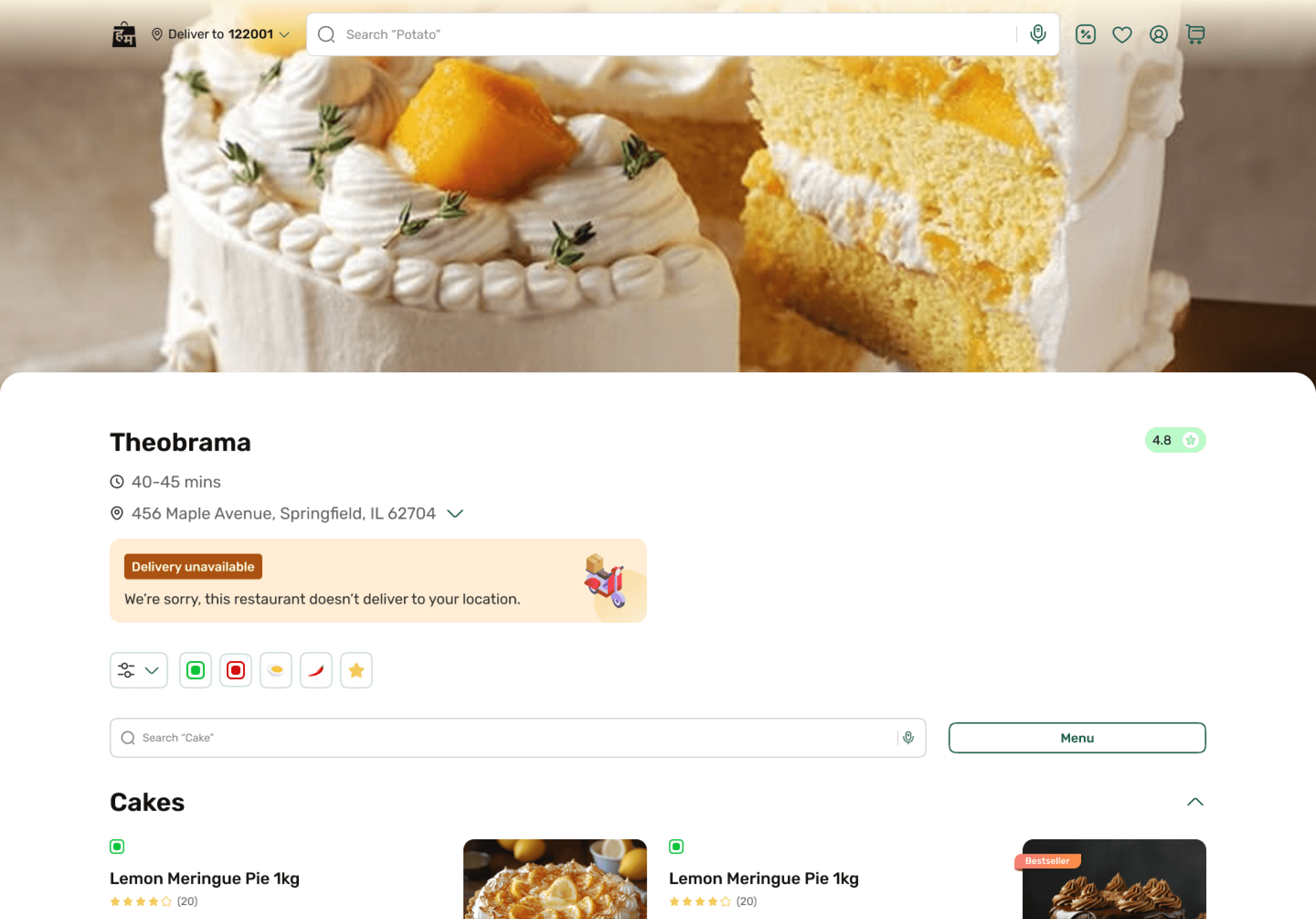
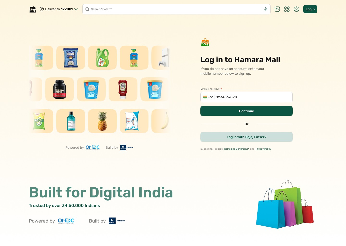
UI Screens

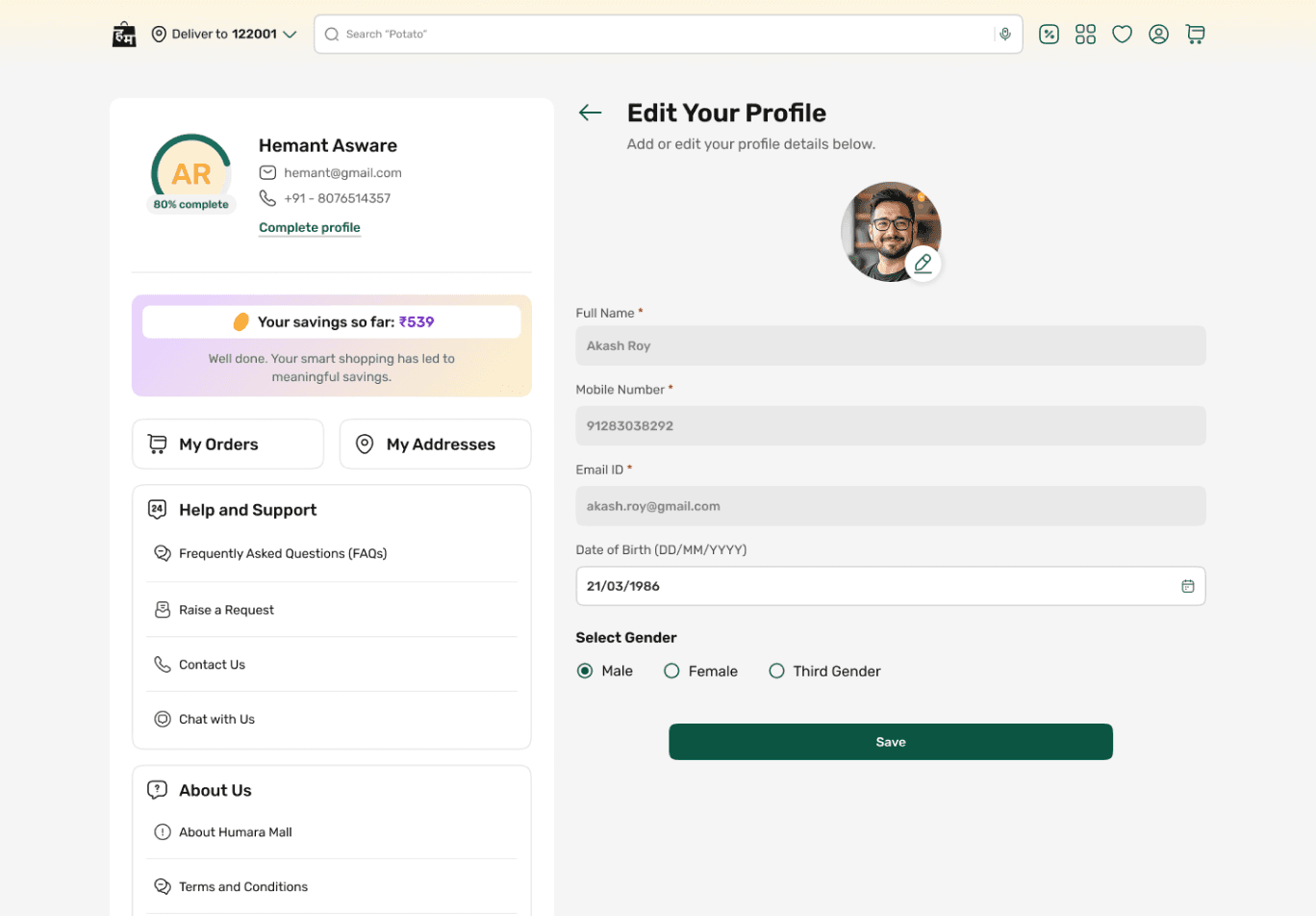

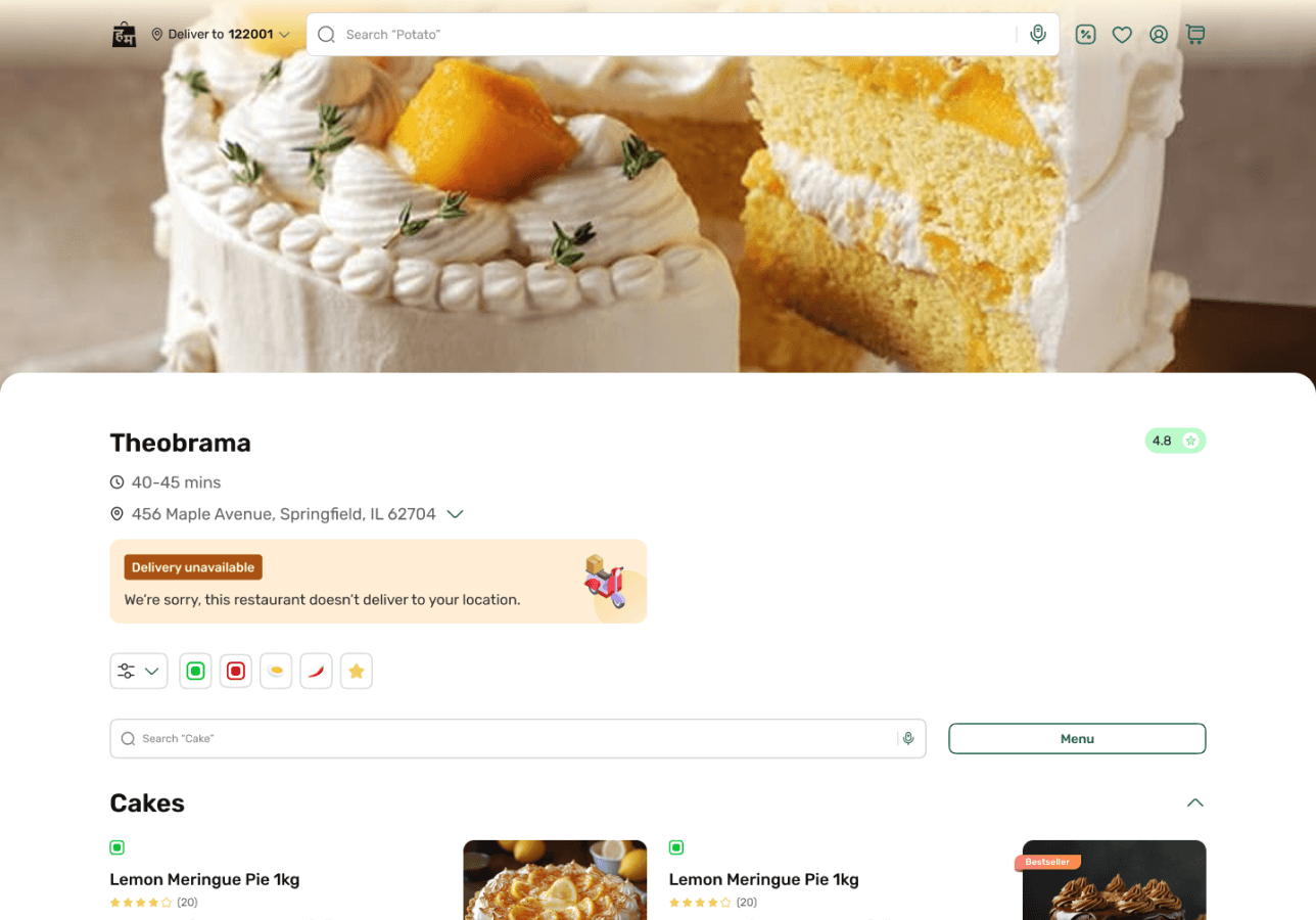
Our Impact
Higher Product Discovery Across Categories
Improved navigation, visual hierarchy, and category organization helped users explore products and brands more effortlessly.
Reduced Checkout & Cart Drop-Offs
Streamlined cart management, profile setup, and checkout flows minimized friction during purchase journeys.
Improved User Confidence & Satisfaction
Clearer layouts, interactive previews, and transparent request tracking created a more trustworthy shopping experience.
Faster User Task Completion
Simplified flows for support requests and account actions reduced effort and improved usability across the platform.
Design & Validate
Before the final Design phase, a detailed plan with an estimated timeline was established.
01
Definition & Foundation
02
Design System Creation
03
Handover & Maintenance Guidelines
01
Definition & Foundation
The UI design brought our ideas to life. Our designers selected UI elements like colours, typography, and a design system aligned with the research and UX recommendations. Another thing we kept in mind was compliance with the brand identity.
Design System Principles
The design principles focused on creating clear, intuitive, and scalable experiences through structured layouts, reusable patterns, visual consistency, and action oriented interactions that simplify user decision making.
Design Creation Principles
Clear Compartment
Easily distinguishable separators within and outside components to help the user understand where one section ends and another begins. Ex - Gutter space between components and margin & spacing within components have been clearly defined in the library.
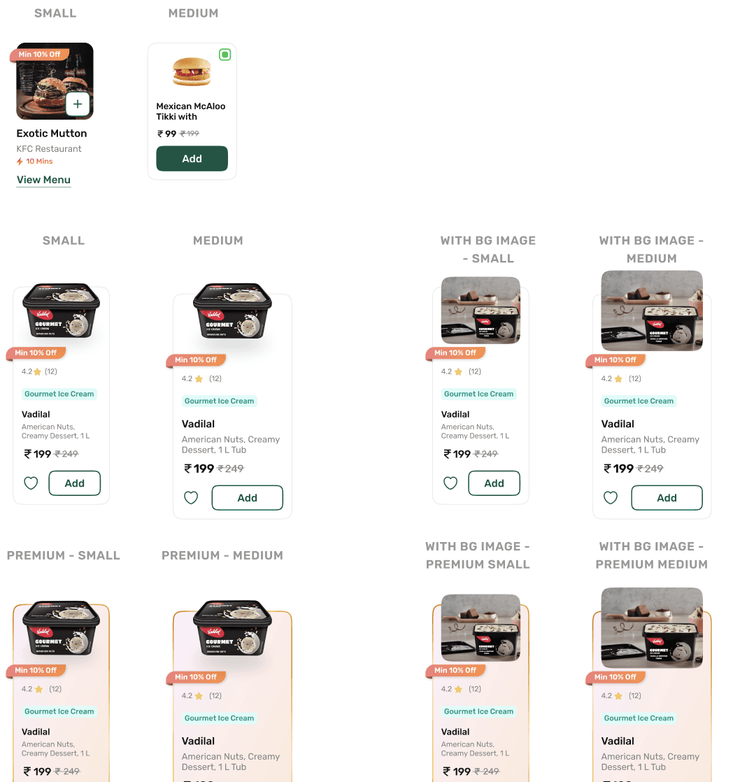
Design Creation Principles
Consistency at Scale
Reusable patterns and standardized interaction behaviors were established to maintain visual and functional consistency across multiple products.
Design Application Principles
Clear Calls-to-Action
Short and visible CTAs that guide users effectively toward purchases.
Design System Structure
Structured a centralised Figma master library using Atomic Design principles, complemented with system guidelines, UX wireframe kits and component documentation to improve discoverability, consistency and efficiency across the design system
02
Design System Creation
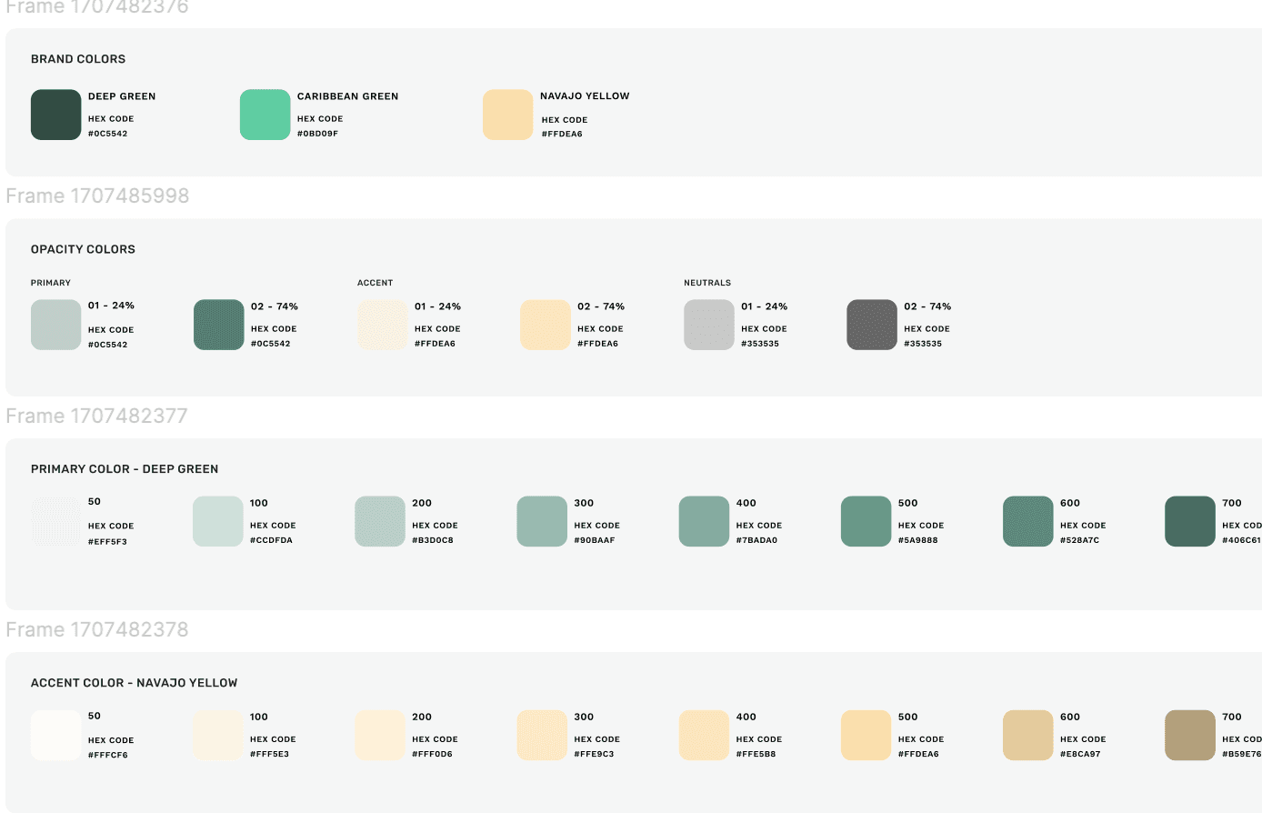
To ensure consistency across the interface, the design system is built on a structured design token architecture that defines the visual foundation of the UI.
Color System
The color system is based on functional tokens rather than static values, allowing components to adapt across different contexts.
Token structure:
element.tone.emphasis.state
This approach improves clarity, simplifies usage, and ensures accessibility compliance across light and dark environments.
Typography
Ensures readability, sets tone, and maintains harmony with other design elements, influencing the overall structure and user experience
Heading
These are used in Headings across components. To maintain hierarchy, these can be used wherever required.
Subheadings
These are used in subheadings, labels across components. To maintain hierarchy, these can be used wherever required.
Body Text /line height
These are used for the following:
Body Text | Captions | Comments | Feedback | Product Description..........
Spacing & layout
Key foundations include:
8pt spacing scale for layout consistency, Responsive grid structure for different viewports, Auto-layout components to support responsive behavio
Simple, user friendly, reliable
Minimalistic n clean with bigger image cards
Illustrations

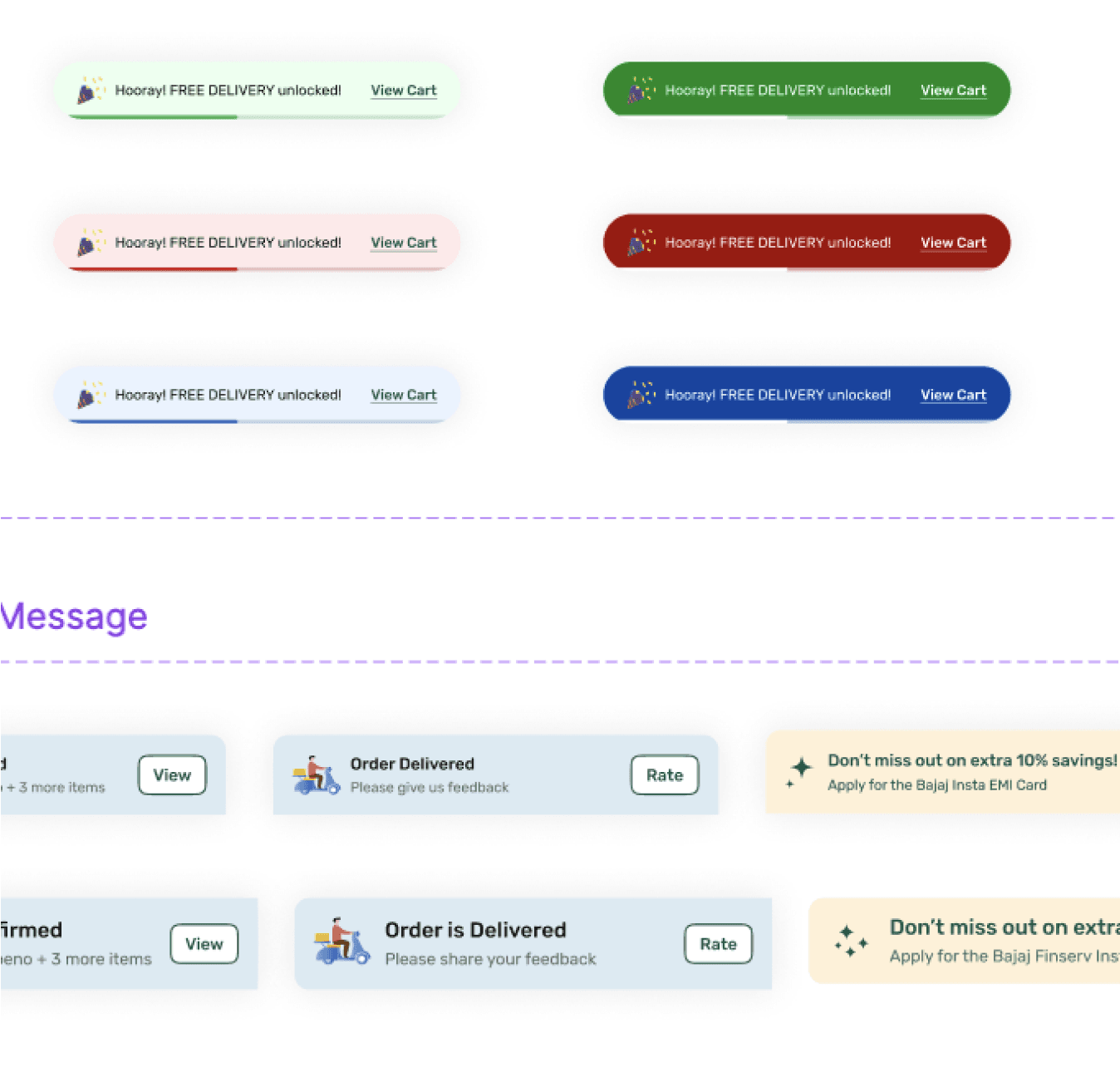
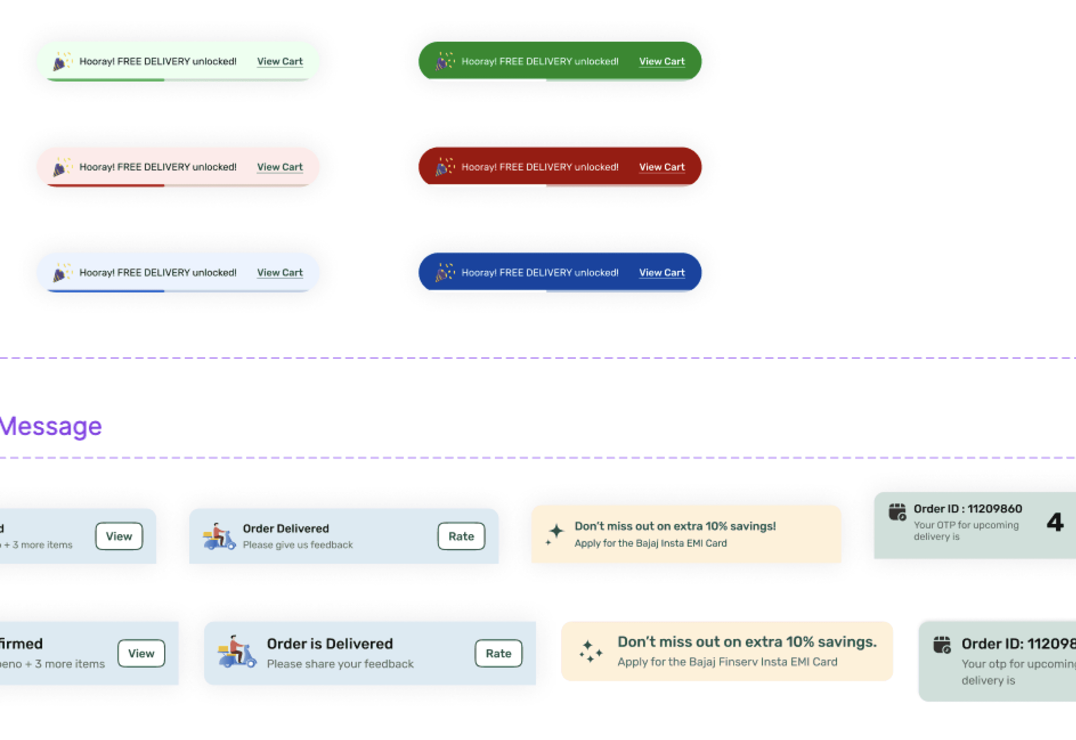
Hooray! FREE DELIVERY unlocked!
View Cart


Croma Store
OPEN
|
09:00 AM - 10:00 PM
Locate Store


+3 more
Vegetables
& Fruits
Delivery Type
Tip
Instructions
Avoid
ringing bell
Leave at
the door
Directions
to reach
Avoid
ringing bell
Leave with Security
4.8
Min 10% Off
Whoooping Burger Land
Mahalaxmi, 7.1km
OPEN
|
North Indian, Burgers, Chinese
From ₹199
Make this as a gift!
Get your items in a special gift bag
Select

20% OFF

TRYNEW
Apply
SAVE ₹40 on this order!
Use code TRYNEW & get 20% off on orders above ₹149. Max. discount: ₹50
Read More

Loreal Shampoo
Qty: 01
0
Order Confirmed
Today
12th May ‘25 - 6:52 PM
Prepared at dispatch centre
Today
12th May ‘25 - 6:52 PM
Waiting for Delivery
Today
12th May ‘25 - 6:52 PM
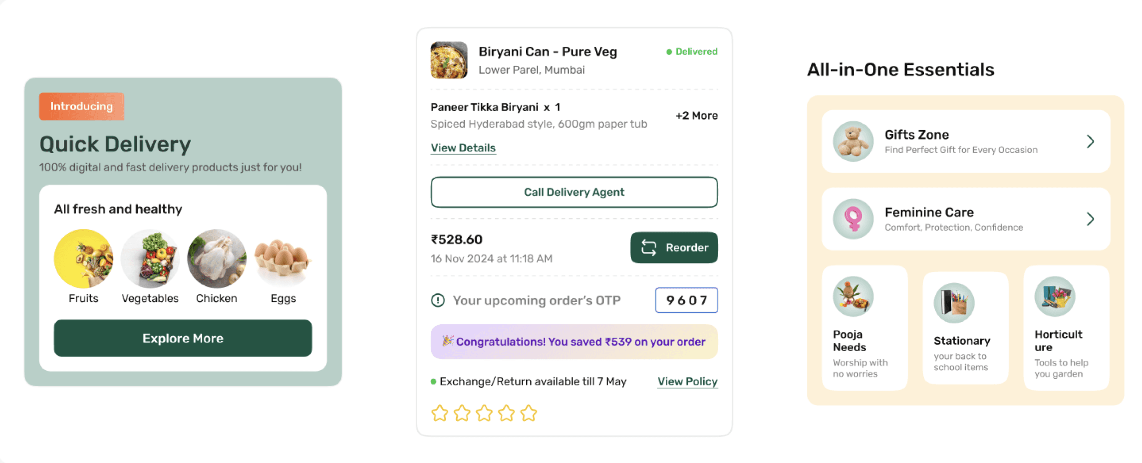
Introducing
Quick Delivery
100% digital and fast delivery products just for you!
All fresh and healthy

Fruits

Vegetables

Chicken

Eggs
Explore More
Illustrations & Icons
Created a unified brand experience by providing clear, consistent visual metaphors that enhance usability and familiarity across the product
Isometric Icons
Image style Illustrations
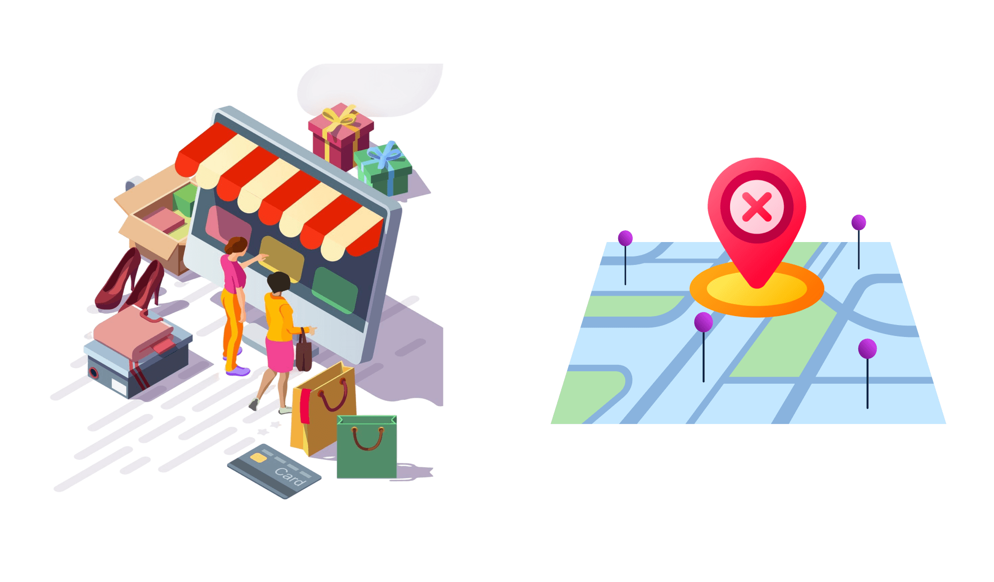
Consistency with Unified Style, Grid alignment, Proportional Scale
Simplicity & clarity with minimal details, recognisability, Abstract forms
Contextual Relevance with funcytional icons& Emotive illustrations
03
Design Documentation & Maintenance
Built to ensure consistency, enable scalability & support long term product success across teams.
Clear Documentation to reduce ambiguity, accelerates onboarding & becomes the single source if truth
For designers, developers, product managers and stakeholders who maintain Bajaj’s Digital Experience
Maintained through defined roles, version controls, contribution process and regular review to keep the system reliable & up to date
UI Screens
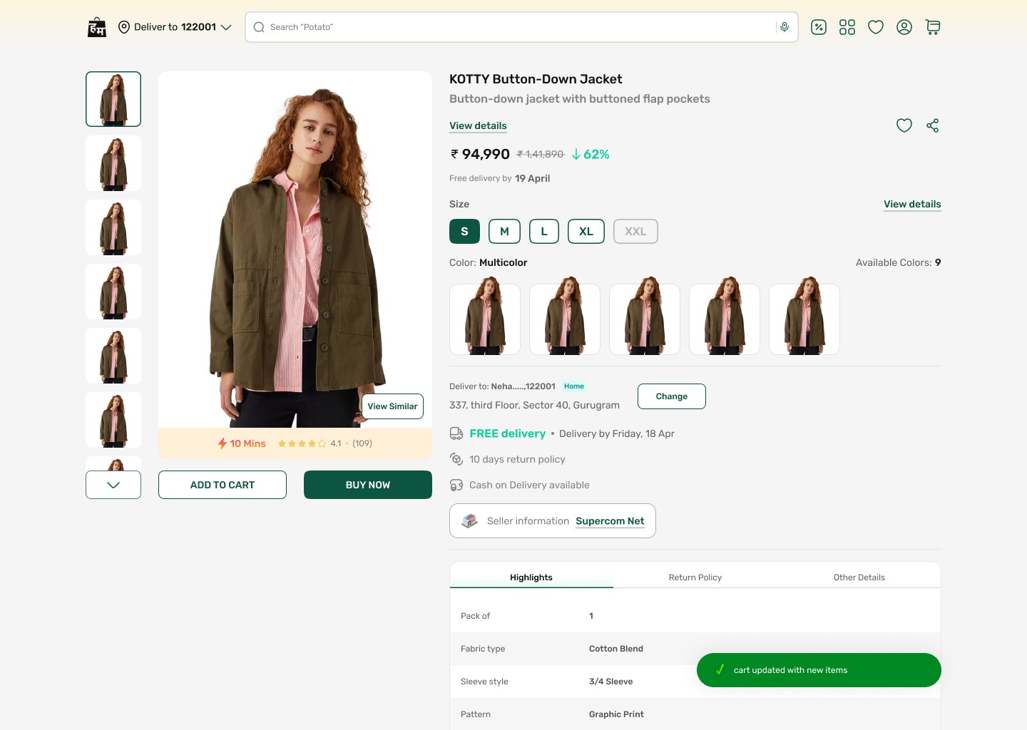
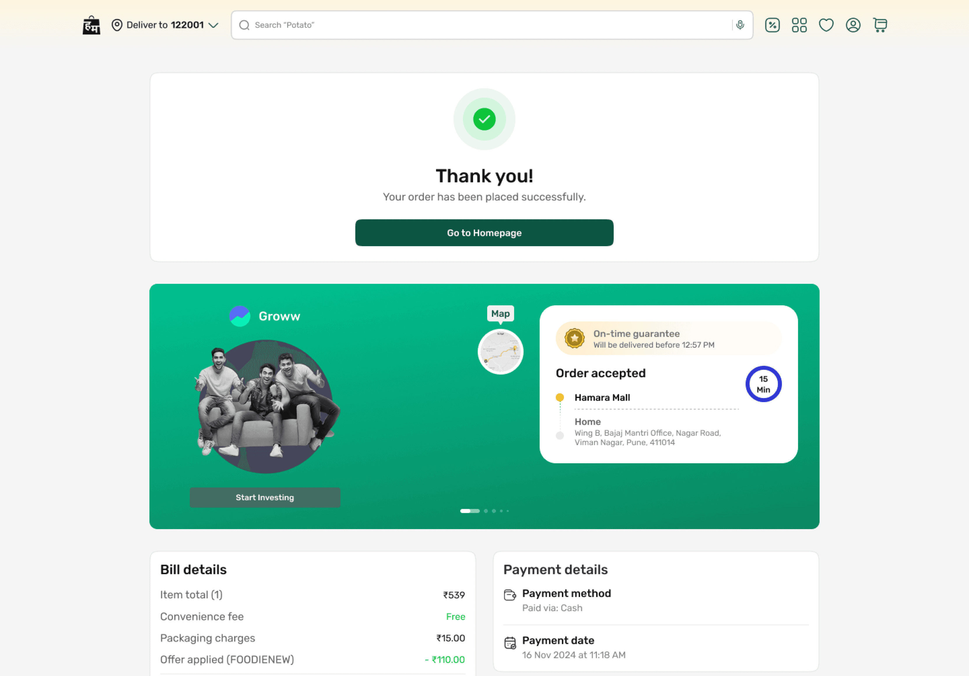
Our Impact
Higher Product Discovery Across Categories
Improved navigation, visual hierarchy, and category organization helped users explore products and brands more effortlessly.
Reduced Checkout & Cart Drop-Offs
Streamlined cart management, profile setup, and checkout flows minimized friction during purchase journeys.
Improved User Confidence & Satisfaction
Clearer layouts, interactive previews, and transparent request tracking created a more trustworthy shopping experience.
Faster User Task Completion
Simplified flows for support requests and account actions reduced effort and improved usability across the platform.
Thank You
Let’s connect
Get in touch for opportunities or just to say hi!